Splash Screen |
  
|
Splash Screen |
|
Overview
The "Splash Screen" tab provides information on the image that is displayed after the device's application icon is clicked (and before it is launched).
The displayed information is editable and you can view your changes in the preview box.
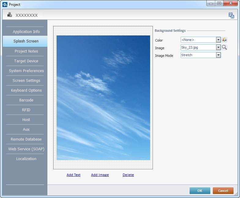
Define the "Background Settings":
Background Settings |
|
Color |
Select the background color for the "Splash Screen". Select it from the drop-down list or click |
Image |
Define the image to be used in the "Splash Screen". Either select an available wallpaper from the drop-down list OR click |
Image Mode |
If you select one of the available wallpapers, the "Image Mode" option will NOT be active. If you select an image (by browsing your PC), you can define how that image will be displayed. Select the best "Image Mode" from the corresponding drop-down list: "True Size" The image is viewed in its true size. Make sure the size of the selected image does not exceed the splash screen area. "Center" The image is centered within the splash screen area. "Stretch" The image is stretched within the splash screen area. "Fit to Area" The image is made to fit the splash screen area. "Tile" The image is displayed in a tile format within the splash screen area. |
If required, use to add text types to the "splash screen".
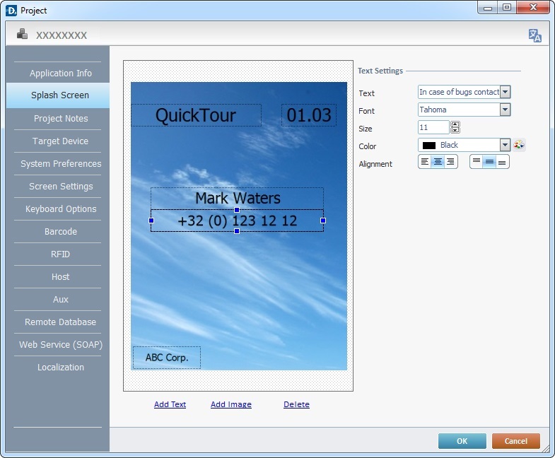
Text Settings |
|
Text |
Define text fields in the splash screen area. You can add custom text or use one of the following project variables - "<Application Name>, <Application Version>, <Author>, <Company>, <Contact>"). Select the text type from the drop-down list. If you want to add or edit the displayed information, select the intended text type and enter your text directly into the drop-down box. |
Font |
Define a font for the selected text type from the drop-down list. |
Size |
Define the selected text type's font size. |
Color |
Define the font color for the selected text type. Select it from the drop-down list or click |
Alignment |
Use the "alignment buttons" to position the text within the selected text area. |
If required, use to add images to the "splash screen".
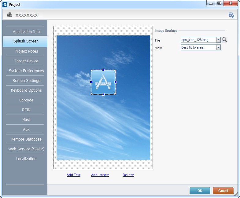
Image Settings |
|
File |
Define the image to be added to the "splash screen". Either select it from the drop-down list (which contains the images available in the "Project Resources" and "Theme" tabs) OR click |
View |
Define how the image should be displayed by selecting from the "View" drop-down list: "True Size" The image is viewed in its true size. Make sure that the selected area is big enough to display the image's true size. "Center" The image is centered within its selected area. "Stretch" The image is stretched according to the selected area. "Fit to Area" The image is made to fit the selected area. "Tile" The image is displayed in a tile format within the selected area. |
You can add as much text types/images as necessary. Use the and/or buttons as many times as necessary.
The Preview Box
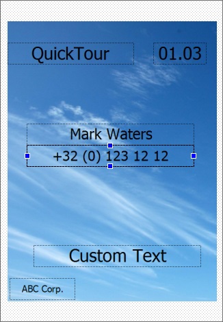
The preview box (to the left) displays the changes made in the "Text Settings" and "Image Settings" and it also allows you to manually rearrange the information displayed in the splash screen:
•Use "drag-and-drop" to move the text/image selection into the preferred position within your splash screen.
•Resize the selected text or image area, by dragging the area's  into the intended position.
•To delete text or an image, select it and click  or press the <DELETE> key in your PC.
•To edit a specific text or image, select it in the preview box and, then, change the corresponding settings options.
Click  to apply the modifications OR proceed to another tab.
 to customize a color.
 to browse your PC for an image.