|
Setting Screen Properties |
  
|
Setting Screen Properties
|
Setting Screen Properties |
|
Overview
Once a screen is added (see Creating and Editing a Screen), the properties window automatically appears. This is where the screen settings are defined. This properties window can be opened at any time during project development so you can edit the corresponding screen settings.
To open the screen's properties window, either right-click the screen's tree view representation and select "Edit" OR open the screen by double-clicking it, in the tree view, and, then, double-click the open screen to access the screen properties window OR right-click the screen and select "Edit".
General tab
The properties window opens with the "General" tab. Below are all the options displayed in this tab. You must adjust or maintain the options/values that are provided.
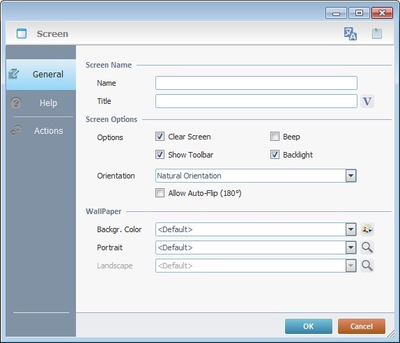
Screen Name |
|||
Name |
Name that represents this screen in the MCL-Designer project (it is displayed in the tree view). Enter the screen name. |
||
Title |
Name displayed on the device's screen toolbar. Either enter it or click |
||
Screen Options |
|||
Clear Screen |
When checked, clears the previous screen before the current one is drawn. If it is NOT checked, the current screen controls are layered on top of the previous screen, which is grayed out. This allows you to create screens with a pop-up effect, for instance. |
||
Beep |
When checked, enables a sound every time screens change. |
||
Show Toolbar |
When checked, enables the toolbar to be visible on the device's screen. See Detail of Screen Toolbar. |
||
Back Light |
When checked, enables the back light on the device's screen. |
||
Select the appropriate option from the following: Natural Orientation - The application's screens are adapted to the target device's default configuration. It is the default option. Portrait - The application's screens are portrait oriented. Landscape - The application's screens are landscape oriented. Auto - This option is the most dynamic and recommended. It allows for both portrait or landscape orientations. The application's screens react to the target device's G-sensor feature and adapt the screen orientation according to the device's current position. This option enables the use of the "Portrait/landscape mode" buttons (see Zoom/Orientation section) and the Flip (180°) - This option enables the application's screens to invert the screen by 180° according to the device's normal orientation. This is a useful feature when dealing with signature collection. The screen (with the"Signature Capture" control) flips upside down to get the signature. Allow Auto Flip (180°) - This option is only active if the chosen orientation is either "Natural Orientation", "Portrait" or "Landscape". Check this option to enable the application's screen to react to the target device's G-sensor and invert screen orientation by 180°. (Make sure the device’s OS setting “Auto Rotate” is enabled”.) |
|||
Wallpaper |
|||
Backgr. Color |
Select a color from the drop-down list or click |
||
Portrait |
Select a wallpaper for the screen's portrait position from the drop-down list or click This field's availability depends on what is selected in the "Orientation" option. |
||
Landscape |
Select a wallpaper for the screen's landscape position from the drop-down list or click This field's availability depends on what is selected in the "Orientation" option. |
||
As an alternative for the defining of a wallpaper, use the shortcut in the "Control" Tab:
|
|||
Detail of the Select a Wallpaper window
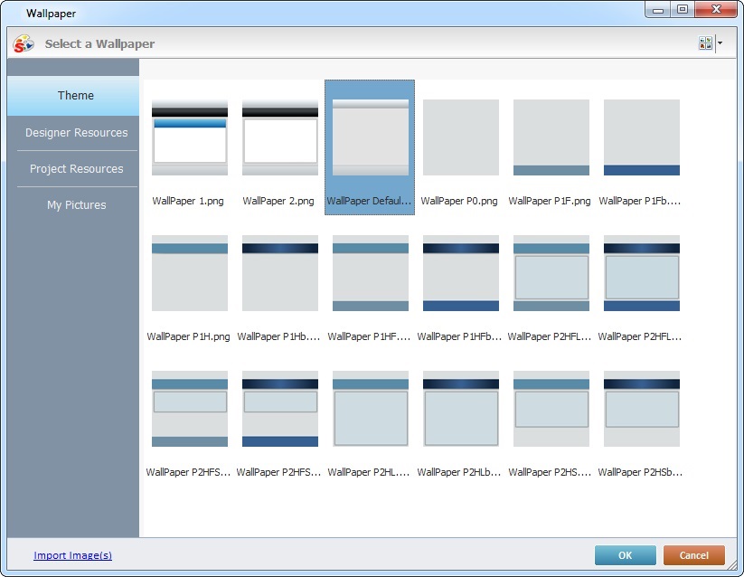
This window opens when you click  in the options concerning wallpaper.
The "Theme" tab is open by default and contains the available wallpapers (the same that are displayed in the "Style Preview Section" when you select  in the "Control" tab).
Select the adequate theme and click  .
.
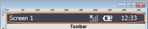
Below are icons that can be displayed in the toolbar of your device's screen.
Connection Type Icons |
|
|
4G/LTE communication is available. |
|
3G communication is available. |
|
GPRS communication is available. |
|
Edge communication is available. |
|
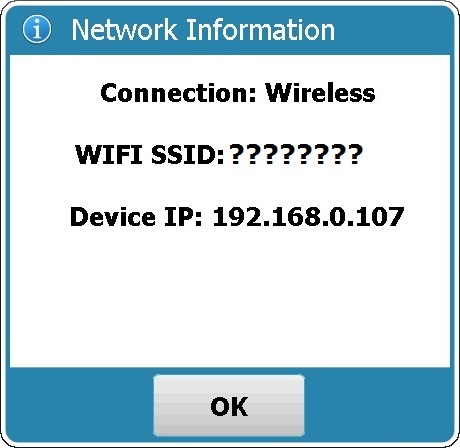
Wireless communication is available. When clicked, it also provides network information:
|
|
Wireless Communication is NOT available. |
|
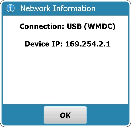
USB communication is available (connection via Windows Mobile Device Center). When clicked, it also provides network information:
|
|
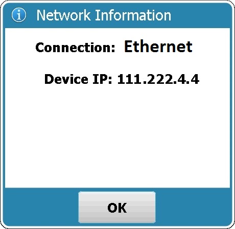
Ethernet communication is available. When clicked, it also provides network information:
|
Power Supply Icons |
|
|
Device is charging. |
|
Device is on battery. |
System/Application Information |
|
|
The current time (as defined in regional settings). |
|
The name of the currently opened screen. When clicked, displays the date (as defined in regional settings). To display the name of the screen again, click the date. |
|
Screen Help available. It is displayed when the operator opens a screen that includes information you added in that screen's properties window (in the "Help" tab). See Help tab. |
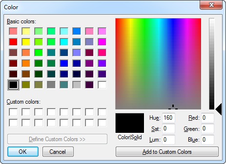
You can customize the "Basic Colors" by changing the values of the available color elements (Hue, Sat, Lum, Red, Green and Blue).
Another tab in the “Screen Properties” window is the “Help” tab. It is used to add text in a "help" format.
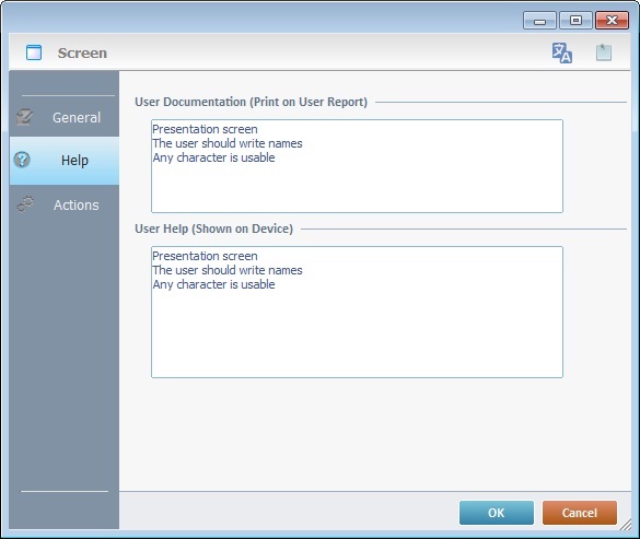
Entering data in the upper box adds information to the project's user report which is created by the "Report Settings" tool (located in the "File" menu > "Report").
Entering data in the lower box, is a text addition to the device itself, a "help" text that is viewed by the operator when he clicks  in the screen's toolbar.
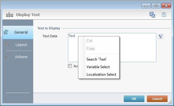
Use the right click in MCL-Designer's input boxes to access certain features regarding the input box's option as well as general actions such as "Copy"; "Paste"; "Search".
Ex: If you right-click the "Text Data" input box (included in a "Display Text" properties window), you are provided with the "Paste", "Search..." and "Variable Select" options.
If you right-click any other input box, it will provide other possibilities.
Actions tab
The final tab in the “Screen Properties” window is the “Actions” tab. It is used to add processes to events that handle data within the screen.
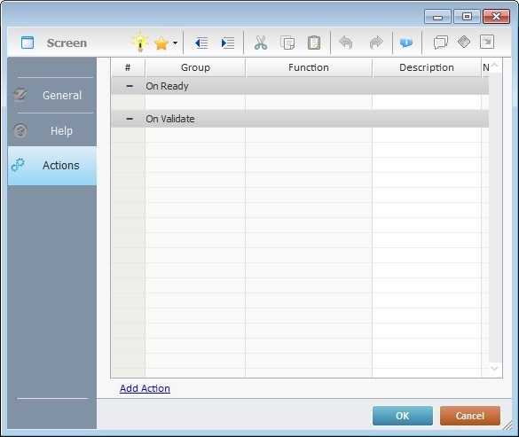
Events are specific actions performed by the operator that trigger actions within the application. These actions, which are defined by the developer, are designated, in the MCL-Designer environment, as processes. There is always a default event associated to a screen but more can be added to the screen.
There are 7 types of events associated to screens:
1. On Ready
This event is executed after the "Routine In" and/or the display of screen controls and, immediately, before the operator begins to interact with the application.
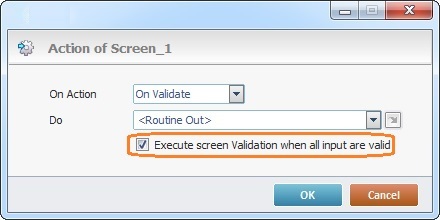
2. On Validate
This event is only executed if:
a) there are controls on the screen requiring validation and
b) their input is, in fact, validated. This background validation uses all established settings from the "Screen Properties" window.
If there are no controls that require validation on the screen, there will be NO input validation and, consequently, the event “On Validate” will NOT be triggered.
Ensure that the "Execute screen Validation when all input are valid" option is checked.
3. On Hotkey
This event is used to define an action that is executed following a specified keystroke (in a virtual (SIP) or hardware keyboard).
This event can be used simultaneously in a screen and in one or more controls, so, it is important to understand how the system will handle On Hotkey event priority. The On Hotkey events will be triggered as follows:
1. The On Hotkey event associated to a control when it comes into focus (ex: a hotkey defined by the developer within a Grid control which triggers a specific process/action).
2. The use of embedded keys within the control with focus (ex: navigating the fields of a "Grid" control with the use of arrow keys).
3. The On Hotkey event associated to the screen that contains the control with focus but triggers other processes(actions).
When using this event, consider the target device and its SIP (Virtual Keyboard). In the case of Windows Mobile devices, if the target device uses a custom SIP instead of the OS default SIP, it may return an unexpected system key. This means that the On Hotkey will NOT be triggered and the associated processes will NOT be executed.
In the case of Android devices, due to its OS implementation that manages data input (ex: the SIP), the use of On Hotkey events in controls that enable keyboard input (ex: "Input Keyboard", "Input Barcode", etc.) is NOT recommended. The data entered with the Android device's SIP is considered text and does NOT trigger the On Hotkey events you added to the control.
4. On Timer
This event is an exception. It is executed due to a lack of activity by the operator during a specific time cycle. It is associated to a specific action - a background Go To Branch Process on a countdown timer. A specific countdown time and a target location can be set. This countdown can be redundant if the “Repeatable” option is checked.
If you use an "On Timer" event on a screen, do NOT add "On Timer" events to any controls included in that same screen.
5. On Power
This event is used to trigger an action the moment the device is connected to an external power source (ex: a cradle). The action (process) will continue to run even if the device is immediately back on battery.
6. On RFID Tag Read
This event is triggered after every tag read. It is used to obtain the data on each tag and to store it in a pre-established variable. See The On RFID Tag Read Event.
This event is used to enable the device's barcode reader and read barcodes, at screen level, without the use of an "Input Barcode" control. The data being read via this event are stored in a local variable - L_Value (&1a).
When an "On Barcode Read" event is added to a screen, you must define the related settings in its properties window:
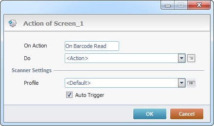
a. If you intend to add other processes to the event, maintain the "<Action>" option in the "Do" drop-down.
If you want to redirect the workflow to another destination within the program that includes the screen, select the appropriate destination.
b. Define the appropriate scanner profile for the event in the "Profile" option:
<Default>
Select this option to refer to the scanner profile settings within a particular device (the scanner settings are set by the device's OS, they are NOT changed by the MCL-Client).
The settings cannot be changed which means that there is no <default> profile in the "Scanner Profile List" window.
OR
"General"
Select this option to use a profile with generic scanner settings. This barcode scanner profile is editable.
OR
Select a scanner profile you have created within MCL-Designer.
You can select a scanner profile from the drop-down OR click  to access a table with a list of the available barcode profiles.
If required, you can also edit an existing profile or add more.
See To Edit a Barcode Scanner Profile and/or To Create a Barcode Scanner Profile.
c. Check the "Auto Trigger" option, if you want the device to, automatically, activate its scanner and read a barcode when the application's workflow reaches the "on Barcode Read" event (when the screen is loaded).
When using the "On Barcode Read" event in a screen, consider the following:
•The operator can scan multiple barcodes without the screen having to reload after every barcode reading.
•If the "Auto Trigger" option is checked, when the screen is loaded/its workflow executes, the device's barcode reader (the beam) is activated automatically.
•If one of the controls in the screen is on focus (all control types except an "Input Barcode"), the event will execute anyway without affecting the control on focus.
We do NOT recommend the simultaneous use of "Input Barcode" controls and the "On Barcode Read" event in the same screen.
If you have an "Input Barcode" and the "On Barcode Read" event in the same screen and the control is on focus, the "Input Barcode" has the priority. Meaning, when the operator first presses the trigger, the data is captured by the "Input Barcode" control. When the operator presses the trigger again, it will execute the "On Barcode Read" event.
This event uses predefined local variables to store the barcode data being read:
Variable Name |
L_Control_Name |
L_Value |
L_Entry_Type |
Variable ID |
&0a |
&1a |
&2a |
Description |
Stores the screen name where this event is used. |
Stores the read barcode's value. |
Stores the read barcode's type (Ex: E08 - EAN8; C128 - Code 128, etc.). |
This event is triggered after every NFC tag read.
When an "On NFC Tag Read" event is added to a screen, you must define the related settings in its properties window:
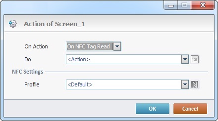
a. Maintain the default "<Action>" option if you intend to add other processes to the event.
If you want to redirect the workflow to another destination within the program that includes the screen, select one of the available destinations.
b. Select the intended NFC profile in the "Profile" drop-down OR click  to access a table with a list of the available NFC profiles and select one. If required, you can also edit an existing profile or create more. See To Create an NFC Profile.
To add an event, click  . See How to Work with Processes.
To add a process, either use the editing bar, located on the top of the "Actions" tab and click  OR right-click any row and select the "Add/Insert ..." option in the resulting menu OR select the intended group of processes in the "Process tab" and, then, drag the process you require from the "Process Display section" onto the "Actions" tab. See Adding and Editing Processes.
The Screen's Right-Click Menu
As mentioned earlier (see Setting of Screen Properties), the screen's properties window can be accessed by right-clicking a screen's empty space and selecting "Edit".
This right-click menu includes the following options:
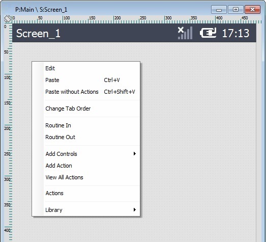
Edit |
Opens the current screen's properties window so you can view or edit its content. |
||
Paste |
Pastes the previously copied element. This option is only active after a "copy" operation takes place. |
||
Paste without Actions |
Pastes the previously copied element but without the attached processes. This option is only active after a "copy" operation takes place. |
||
Change Tab Order |
This option is only available when there are multiple Input Controls (ex: an Input keyboard and an Input Barcode) in the screen. Its purpose is to establish the order of the data input. See Tab Order below. |
||
Routine In |
Adds a "routine in" prior to any graphic information being displayed on the screen. Once the screen contains a "routine in", this option is used to open/edit that "routine in". See Working With Routine In. |
||
Routine Out |
Adds a "routine out" that is executed after all the controls and processes within the screen are validated/executed. Once the screen contains a "routine out", this option is used to open/edit that "routine out". See Working with Routine Out. |
||
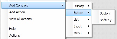
Add Control |
Provides a list of the available controls you can add to the screen. Mouse over the options to open the respective list and select the intended control.
Mouse over the options to open the respective list, select the intended control and, then, fill in its properties window. To get detailed information on how to fill in these properties windows, refer to each control's chapter. |
||
Add Action |
Allows you to add a compatible event to the selected screen. See Events associated to Screens. Click this option and select the intended event in the resulting window. The corresponding "Actions" tab opens and you can further add the required processes to the new event. Conclude by clicking |
||
View All Actions |
Opens a window that displays the screen's events, controls and processes which are also editable. See Detail of a "View Actions" window. |
||
Actions |
Provides direct access to the screen's "Actions" tab. |
||
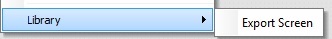
Library |
Allows you to export the current screen into Library.
|
The tab order defines the order that input controls will follow when pressing the "Tab" key or when the control is validated within a screen.
To have a control follow a defined tab order, it must have the option "Tab Stop" enabled (in the control's "Layout" tab).
To view the screen's tab order and/or change it, proceed as follows:
Step-by-step
1. Right-click an empty area of the current screen.
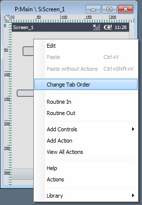
Remember that this option is only active for screens that contain more than one input control.
2. Select the "Change Tab Order" option.
The input controls come into focus displaying an overlapping red square with a number that refers to the current tab order.
By default, the tab order is set according to the control's position within the screen - from top to bottom and from left to right.
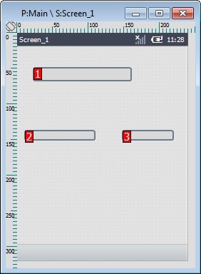
3. If required, change the tab order by clicking each control in the intended sequence, meaning, your clicking sequence will become the new tab order:
|
|
|
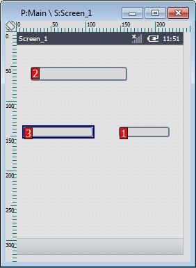
Ex: This tab order change is the result of the following clicking sequence:
•First, the control to the right was clicked (the corresponding number turned into a "1");
•Second, the control closest to the top was clicked (the existing number was replaced with a "2");
•Third, the control to the left was clicked (turning its number into a "3").
4. Press <ENTER> in your PC keyboard to apply your changes.
As an alternative to step 4, you can use the screen's right-click menu:
a. Right-click an empty area in the screen.
b. In the resulting menu, click "Change Tab Order".
c. Click  to apply your changes,
  to set the focus back on the screen without applying your edition or
  to keep focus on the input controls and be able to modify the tab order.
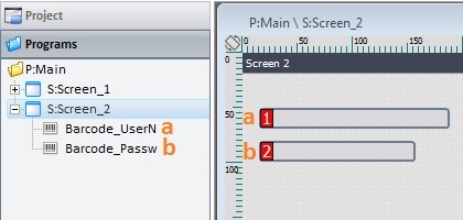
As an alternative, use the drag-and-drop of input controls within the tree view - the first control to be represented in the tree view is the first control to receive input, then, the next control and so on.
Example of Tab Order Change Via Control "Drag-and-Drop" in the Tree View
|
|
|
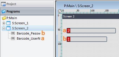
The defined tab order is "Barcode_UserN", then, "Barcode_Passw". Once you drag-and-drop the "Barcode_UserN" control under "Barcode_Passw", the tab order changes - the first control to receive input is "Barcode_Passw" and the next is "Barcode_UserN". |
||
Detail of a View All Actions window
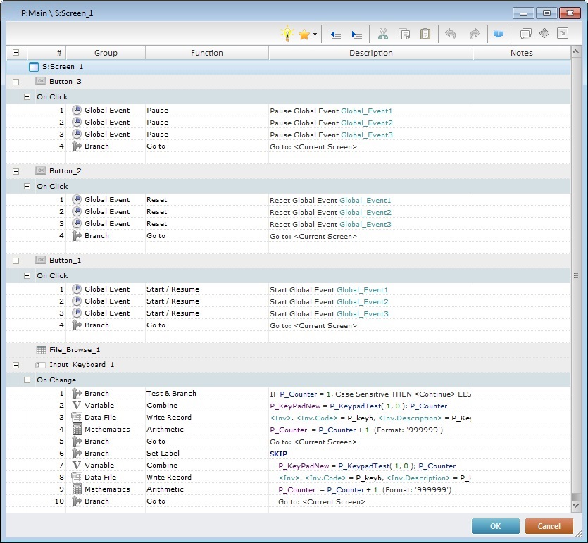
The View Actions window displays the information regarding the active screen and the controls, events and processes included in it.
It is used to view all the elements included in the active screen (events,controls, processes) and it is also editable, meaning, you can add processes to either screen or controls as well as edit screen, control and process properties.
To edit an event's properties, double-click the intended event to open an "Event" window. In the "Do" box, either maintain the default option "<Action>" (if you want to add processes) or select one of the "Go to" shortcuts provided by the drop-down or  list.
list.
To add an event to the screen or a control, right-click the element that will include the event and click "Add Action". in the resulting window, select the intended event and define its settings.
See Events associated to Screens.
See Events associated to Controls
To add processes to an event, use one of the following:
•Double-click an empty line to open a "Process List" (see Detail of Process List) and select the appropriate process.
•Drag the intended process from the "Process Display Section" (located to the right of the "Work Area") and drop it on the intended event.
•Use the editing bar (see Detail of the Editing Bar). Click to open a "Process List" and select a process.
•Right-click the event that will contain the new process, click the "Add/Insert" option and, in the resulting "Process List", select the intended process.
To edit the properties of a control or a process, double-click the intended element to open the corresponding properties window and make the required changes.
Below are all the available right-click menus in the "View All Actions" window.
Screen Right-click Menu |
||
|
Opens an "Event" window. Select the intended event and fill in the necessary related options. |
|
Event Right-click Menu |
||
|
Opens a process list. Select the intended process and fill in the corresponding properties window. |
|
Deletes the selected event. |
||
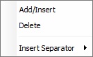
Inserts a separator above the selected row. There are 3 types of separators to select from ("********", "--------" or "........"). |
||
Process Right-click Menu |
||
|
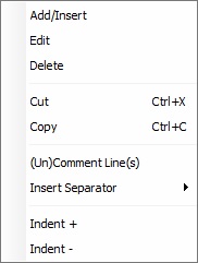
Add/Insert |
Opens a process list. Select the intended process and fill in the corresponding properties window. |
Edit |
Opens the properties window of the selected process for editing. |
|
Delete |
Deletes the selected process. |
|
Cut |
Cuts the selected process. |
|
Copy |
Copies the selected process. |
|
(Un)Comment Line(s) |
Disables/enables the selected row. |
|
Insert Separator |
Inserts a separator above the selected row. There are 3 types of separators to select from ("********", "--------" or "........"). |
|
Indent + |
Indents the description's content to the right.
|
|
Indent - |
Indents the description's content to the left.
|
|
Control Right-click Menu |
||
|
Opens an "Event" window. Select the intended event and fill in the necessary related options. |
|
To modify process execution order, either drag the selected process to the intended target or use the  (cut),
  (copy) and
  (paste) icons from the "Editing" bar (see Detail of Process List).
 to select a variable with that value.
 icon located on the upper left corner of every screen which is used to alternate the current orientation of the screen ( portrait or landscape) it is associated to.
 to customize it. See