|
Adding a "Button" Control to a Screen |
  
|
Adding a "Button" Control to a Screen
|
Adding a "Button" Control to a Screen |
|
Control Purpose
This control is used to deploy an action. It can include text or images.
If your MCL-Designer V4 subscription includes Speech attributes, it will affect the "Button's" use - the operator will be able to activate this control manually (via the keyboard or touchscreen) or through a spoken word.
Add a button to a screen by dragging a "Button" control  from the top section of the "Control" tab OR the "Style Preview Section" onto the screen.
Step-by-step
1. Drag the control onto the screen:
•If dragged from the "Control" tab, the control will assume the default style.
•If dragged from the "Style Preview Section", it will assume that particular style.
2. Now, double-click the selected control on the screen OR the tree view to open the properties window.
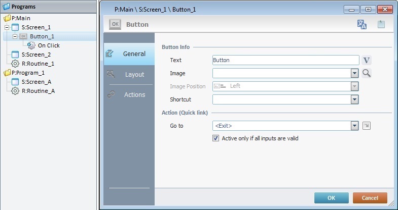
The "General" tab is open by default.
3. In the "Button Info" section, add text or an image to the "Button" control which is displayed on the device's screen.
To add text:
a. In the "Text" box, enter the required text or click  to select a variable with that value. See Variable Definition.
b. Continue to step 5.
To add an image:
a. In the "Image" box, click  to open a window with tabs that contain image resources ("Theme", "Designer Resources", "Project Resources", My Pictures" and a tab representing the folder you previously used as a source for an image import. In the case of the image below, it is the "C:\...\Pictures\" tab).
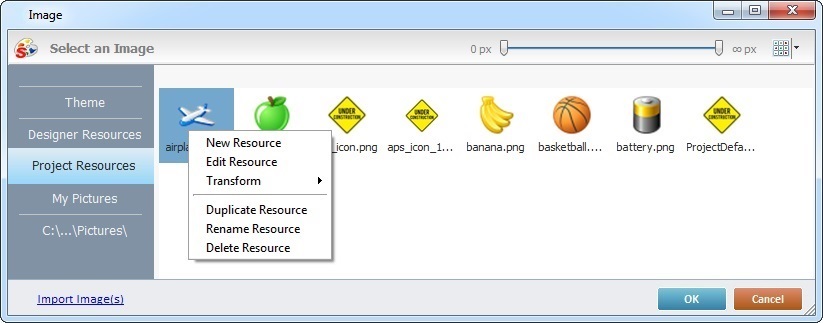
This window allows you to control the displayed images:
•Click  and select the most appropriate view ("Large Icons", "Medium Icons" and "Small Icons").
•Use  to filter the image display according to the defined resolution.
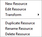
Right-clicking an existing image resource, opens a menu with several options. The available options vary according to the resource's location (the tab that includes the selected image).
Below are all the possible options:
|
New Resource |
Opens an OS browse window. Browse for an image, select it and import it into the tab that is currently open. |
Edit Resource |
Opens your default image editor. Edit the selected image. |
|
Transform |
Allows you to rotate (90o, 180o or 270o) or flip (horizontally or vertically) the selected image file. |
|
Duplicate Resource |
Duplicates the selected image. The duplicate has the same name as the original resource plus an incremented number. |
|
Rename Resource |
Sets the image's name into "edit" mode. Enter the new name and click <Enter> in your PC keyboard. |
|
Delete Resource |
Deletes the selected image. Click |
b. Open the tab that contains the image you want to use.
c. Select the image.
 To avoid image display issues, make sure that the dimension of the selected image resource and the target area of the Button control are the same.
d. Click  to save your image choice and return to the "General" tab.
As a further option, you can import images into your project (the image resource will be displayed in the "Project Resources" tab and the "Resources" module):
a.click  (located on the lower left) to open an OS browse window.
b. Select the image you want to import and click  .
.
No matter which tab you had open when you clicked , the imported image is placed in the "Project Resources" tab.
c. If you want to add the imported image to the button, select it (in the "Project Resources" tab)and click to apply.
4. There is an advanced option regarding the image element that allows you to rotate or flip the selected image:
If required, right-click the "Image"option to access the "Advanced Image Settings" option and follow the steps described in The Display of a Control's Image Element.
5. This option only becomes active after you have selected an image. Define the desired position of the image inside the "Button" (either "Top", "Bottom", "Left" or "Right").
6. If required, select a shortcut key in the keyboard of the device to have the same function as the "button". Select one from the drop-down list in the "Shortcut" box.
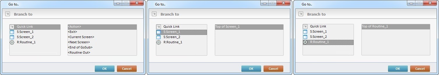
7. At this point, a target location can be assigned to the default event "Click" attached to the control. Select a target location from the drop- down OR  list. The selected target location is automatically displayed in the "Actions" tab. See Detail of a window below.
Detail of a window
|
This window is an alternative to the drop-down list of destinations: a. Select a destination screen or routine within the same program as this control, in the left table. b. Specify the target even more by selecting from the table to the right. The available options are a consequence of your choice in the left table. c. If you want to add other processes to the execution flow instead of defining a target with a Go to process, select the "<Action>" option. d. Finish this operation by clicking |
 The function of this control is, usually, to send the operator to a particular screen after a "Click" event. That means that a "Go to" process is necessary to enable an action (to deploy to a specific location such as "Exit", "Next Screen", etc.) triggered by that event. If the target location for the "Click" event is specified here, it will not be necessary to add a "Go to" process in the "Actions" tab.
8. If required (when the screen also contains input controls), check the "Only if all inputs are valid" box. That means that the "Button" will only become active if every input control, in that screen, is considered valid.
9. Go to the "Layout" tab.
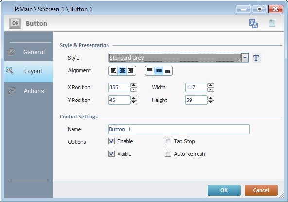
10. Define the control's style by selecting an option from the drop-down list or by clicking  . See Editing and Creating Styles and Editing and Creating the "Button" Style.
11. Position the text, within the control, with the alignment buttons.
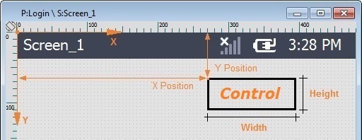
12. Maintain the given values or specify the control's position/size, within a screen, by providing the "X" and "Y" coordinates as well as "Width" and "Height".
Detail of Position/Size values
13. Attribute a name to the control. This name is displayed in the tree view.
14. Consider whether or not to check the following options:
"Enable"
Activates the control's input feature.
"Tab Stop"
Must be checked to enable a "Change Tab order". This provides the possibility to change the order (between data input controls) in which the information is keyed in by the operator.
"Visible"
Manages the control's visibility in the device's screen.
"Auto Refresh"
Enables an automatic update of the visible information, every time the value of the variables used is modified.
15. If the target location for the "Go to" process has already been defined, end the addition of a "Button" operation by clicking to apply all your chosen options.
If the "Go to" option in the "General" tab was left unfilled (step 7), continue to step 16.
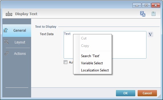
Use the right click in MCL-Designer's input boxes to access certain features regarding the input box's option as well as general actions such as "Copy"; "Paste"; "Search".
Ex: If you right-click the "Text Data" input box (included in a "Display Text" properties window), you are provided with the "Paste", "Search..." and "Variable Select" options.
If you right-click any other input box, it will provide other possibilities.
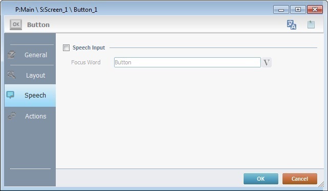
Speech Feature If your MCL-Designer V4 subscription includes Speech attributes, you will have access to an extra tab - "Speech"- where you can define this control's speech possibilities.
All speech related options within this control are explained in another topic - see Speech in the "Button" Control. Once you have gone through the topic, use the provided link to return to this step-by-step and continue to the "Actions" tab (step 16).
If your MCL-Designer V4 license does NOT have Speech attributes, the next tab is the "Actions" tab. Continue to step 16. |
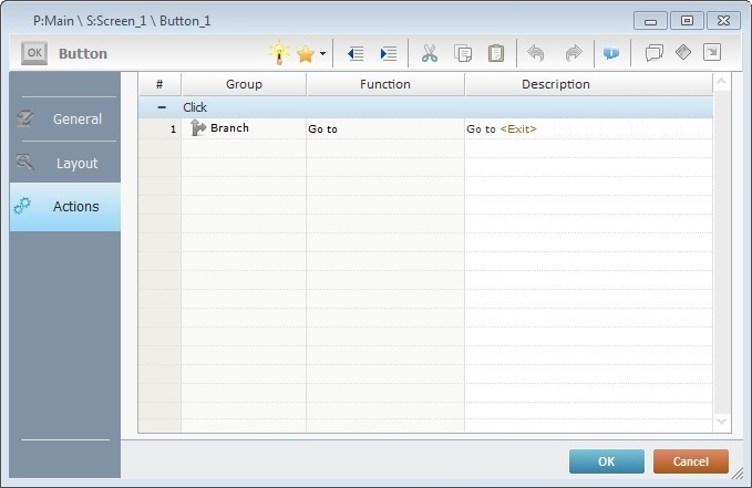
Keep in mind, that there is always a default event (ex: "Change"; "Timer"; "Hotkey"; etc.) attached to the control (in this case, a "Click" event). If you want the event to trigger an action, you must add processes to it (ex: "Go To"; "Check File"; "Set Focus"; etc.).
By default, the "Button" already includes a "Go to" process (see Working with the Go to Process) attached to the "Click" event.
17. To edit the "Go to" process, double-click the process OR right-click the process and select "Edit..." in the resulting menu. Either of these choices opens a "Go to" process window.
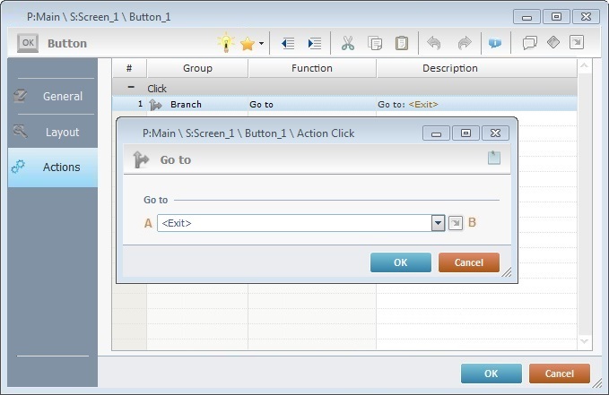
18. Select from the drop-down (A) or (B) list:
A |
Provides targets for a "Go To" action (see Working with the Branch Processes Group). After the operator has fulfilled the "Change" event, the workflow will proceed to the selected destination. If you want to add processes other than a "Go to", select the "<Action>" option. |
B |
Provides quick links for a "Go To" action ("Next Screen"; "Exit"; etc.) to be executed when the event is fulfilled. See Detail of a |
Detail of a window
|
This window is an alternative to the drop-down list of destinations: a. Select a destination screen or routine within the same program as this control, in the left table. b. Specify the target even more by selecting from the table to the right. The available options are a consequence of your choice in the left table. c. If you want to add other processes to the execution flow instead of defining a target with a Go to process, select the "<Action>" option. d. Finish this operation by clicking |
19. If required, double-click the empty line below the event or click  in the Editing Bar to add a process to the event. See Adding Processes to a Screen or a Control.
This control has predefined local variables (only available in event context). See "Button" predefined local variables.
Before concluding the addition operation, check the following:
Remember that the "Enable" option (located in the "Layout" tab) must be checked so that the added actions/processes run.
20. If required, use the icons located on the upper right corner of the "properties" window:
Click this icon to open a "Localization" window where you can edit the text element within that control or add translations to it. See Localization.
Click this icon to attach any relevant notes to this control. Enter your text in the resulting window. This information is displayed in the "Developer report". See Report.
21. Click in the "Actions" tab to apply the choices made.
The "Button" has been successfully added to the screen.
To activate an instant "Edit Text" mode, select the "Button" and click the <Space> key. To set the control back to "view mode", click outside the control's area OR click "<Enter>" in your PC keyboard.
If any subsequent edition of the control's properties is required, double-click the "Button" OR select "Edit" (in its right-click menu) to open the properties window.
If you want to view this control applied within an application, see Sample Applications.
Button Predefined Local Variables
This control has predefined local variables (only available in event context).
Event |
Click |
Variable Name |
L_Control_Name |
Variable ID |
&0a |
Description |
Stores the control's name (*) |
* Defined in the control's properties window ("Layout" tab).