|
Navigating MCL-Mobility Platform |
  
|
Navigating MCL-Mobility Platform
|
Navigating MCL-Mobility Platform |
|
Overview
MCL-Mobility Platform is a user-friendly management application. It only displays the available sections/options according to access rights and informs the user about any incompatibilities regarding the tasks that the user is scheduling and/or performing. There are several general aspects that enable you to navigate, view and edit the available options.
Navigating MCL-Mobility Platform
Use the Breadcrumbs mechanism (located below the web page's header). This is a type of navigation scheme that reveals the user’s location in a website or Web application and enables the user to move between pages. Click directly on the page representation you wish to go to.
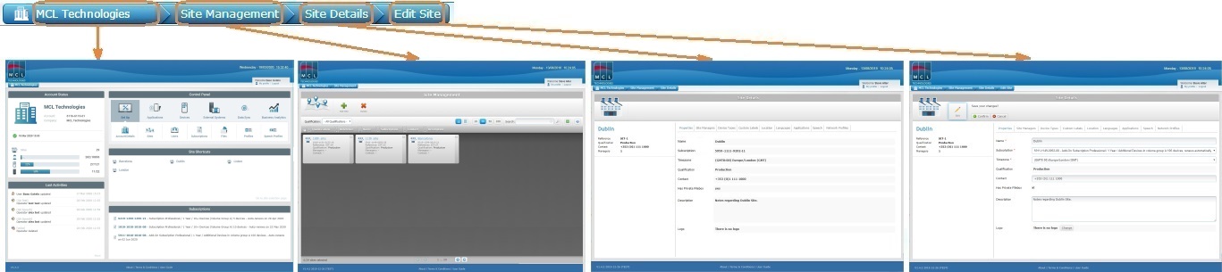
The Breadcrumb bar above informs the user that he is currently in a "Site Details" page, on edit mode. The user can go to any of the pages displayed in the breadcrumb's sections. For example:
•By clicking "Site Management", you access the "Site Management" page.
•By clicking "MCL Technologies", you access the account's Admin Dashboard (ex: Account example name is "MCL Technologies").
In the Admin Dashboard, when you click a specific site (in the "Site Shortcuts" section), you open a new web browser tab. This new tab displays the Site Dashboard of the selected site (see Site Dashboard).
Navigation Buttons
The following buttons are recurrent. Use them to move around.
 Click the page buttons located on the lower right corner of each view (every time the number of items exceeds one page) to navigate to the desired page.
 Click this button to go to the top of the page.
Recognizing Clickable Elements
All the MCL-Mobility Platform's clickable elements are displayed in light blue.
Ex: In the following image, you can click "My profile" and "Logout".
The exception is the footer area, where there are 3 links (About | Terms & Conditions | User Guide) that do not use the "light blue" rule.
View/Edit Mode
Most of the pages of MCL-Mobility Platform are initially displayed in view mode which does NOT allow for any changes.
Use the  button to edit the available options within any page of the application. Click it to set the corresponding page to edit mode.
It is also possible to trigger the edit mode by double-clicking the data/field you want to edit.
Always end the "editing" operation by clicking  /
/  to apply the modifications OR
  /
/  to abort.
Recurring Buttons
 Is used to display hidden options. Depending on the page's context, it may provide different options.
 Is used to provide a grid view.
 I used to provide a list view.
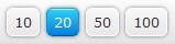 Are used to control how many items are displayed per page at a time.
 Is used to search for specific list items.
 Is used to export a list of account/site elements (ex: operators, devices, users, etc).
 Is used to refresh the page's information.
 When checked, selects all items in a list/grid.
 When checked, selects the single corresponding element.