|
Adding a "Display Image" Control to a Screen |
  
|
Adding a "Display Image" Control to a Screen
|
Adding a "Display Image" Control to a Screen |
|
Control Purpose
This control is designed to add an image to a screen.
All the images used within the project are stored in the "Resources" module. The added image can be used as a background for the screen because it always positions itself behind the other controls in that screen.
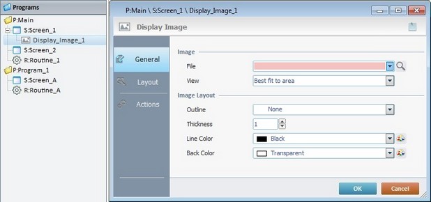
To add an image, drag a "Display Image" control  on to the screen. At this stage, there is still no image displayed, there is only an empty area within the screen. The "Display Image" control only displays an image after one is selected in its properties window (in the "General" tab, "File" option).
If there is no image selected in the "Display Image" control, an error icon  is displayed in its place, on the screen. The "File is missing" error message also appears in the corresponding properties window.
Step-by-step
1. Drag the control from the "Control" tab onto the screen.
2. Now, double-click the selected control on the screen OR the tree view representation to open the properties window.
The "General" tab is open by default.
3. In the "File" option, define the image to be used in the control.
When selecting an image, consider its resolution, its purpose and the target device.
We recommend the use of an image with a resolution that matches the resolution of the control it is inserted in.
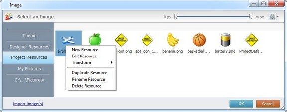
Either select it from the drop-down list (which displays the project's image resources) OR click  and select an image from the available tab options ("Theme", "Designer Resources", "Project Resources", "My Pictures" and a tab representing the folder you previously used as a source for an image import. In the case of the image below, it is the "C:\...\Pictures\" tab).
 Click Here to View Details on Clicking
If you click
This window allows you to control the displayed images:
•Click
•Use
Right-clicking an existing image resource, opens a menu with several options. The available options vary according to the resource's location (the tab that includes the selected image). Below are all the possible options:
a. Open the tab that contains the required image.
b. Select the image.
c. Click
|
Click Here to View Details on Importing an Image
Instead of selecting an image from the available tabs, you can import the required image from an outside source:
a. Click
b. Browse for the required image in an OS browse window and select it.
c. Click
No matter which tab you had open when you clicked
d. In the "Project Resources" tab, select the image you have imported.
e. Click
|
Alternatively, you can enter the path (relative or absolute) to locate the image file you want to add to the "Display Image" control (see Working with Aliases) OR simply drag an image from an OS browse window and drop it in the "File" field.
4. There is an advanced option regarding the image element that allows you to rotate or flip the selected image:
If required, right-click the "File"option to access the "Advanced Image Settings" option and follow the steps described in The Display of a Control's Image Element.
5. Define how the image should be displayed in the "View" option by selecting from the drop-down list:
"True Size"
Enables the viewing of the image in its true size. Make sure that the "Display Image" control's area matches the size of its content.
"Center"
Centers the image within the area of the "Display Image" control.
"Stretch"
Enables the stretching of the image.
"Fit to Area"
Displays the image to fit the area of the "Display Image" control.
"Tile"
The image is displayed in a tile format.
6. Define the image layout by filling in/selecting various options:
"Outline"
Select an option from the drop-down list ("Simple"; "Double"; "Dashed" or "None"). If you select "None", the "Thickness" and "Line Color" options are not active.
"Thickness"
Define the outline thickness. Only active if you have selected an image outline.
"Line Color"
Select a color for the outline. Select it from the drop down list or click  to customize a color. Only active if you have selected an image outline.
"Back Color"
Select the background color for the "Display Image" control. Select it from the drop-down list or click to customize a color.
7. Go to the "Layout" tab.
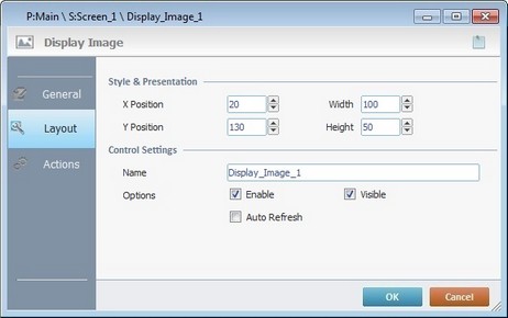
8. Maintain the given values or specify the control's position/size, within the screen, by providing the "X" and "Y" coordinates as well as "Width" and "Height".
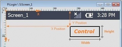
Detail of Position/Size values
9. In the "Control Settings" section, attribute a name to the image. This name is displayed in the tree view.
10. Consider whether to check the following options or not:
"Enable"
Activates the control's features.
"Visible"
Controls the visibility of the control on the device's screen.
"Auto Refresh"
Unchecked by default. Enables an automatic update of the image, whenever the content of the variable for the file name is modified.
11. If the project requires an action to be executed after the control is displayed, such as a "go to the next screen", continue to step 12.
If not, end the addition of a "Display Image" control by clicking  to apply all of the chosen options in both tabs ("General"and "Layout").
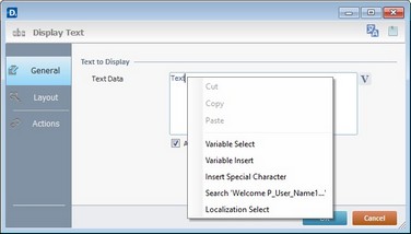
Use the right-click in MCL-Designer's input boxes to access some related options as well as the general "Cut"; "Copy"; "Paste"; "Search"actions (active/inactive according to the current context).
Ex: If you right-click the "Text Data" input box (included in a "Display Text" properties window), you are provided with the general editing/search actions and other specific options such as "Variable Select" (see "Variable Select") ;"Variable Insert" (see "Variable Insert"), "Insert Special Character" (see To Insert Special Characters into a Control's Text Input Field) and "Localization Select" (see Localization List).
If you right-click any other input box, it may provide other possibilities.
12. Go to the "Actions" tab.
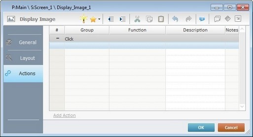
Default event: "Click" - Is triggered when the operator clicks the "Display Image" control.
There is always a default event contained in a control (ex: "Click"; "Timer"; "Change"; etc.). In this case, the default event is "Click". An action (usually a "Go to" process) must be added to be executed upon the "Click" event. If there is no action/process attached to the default event, it will not proceed.
13. If required, double-click the empty line below the event or click  in the Editing Bar to add a process to the event. See Adding Processes to a Screen or a Control.
This control has predefined local variables (only available in event context). See Display Image's Predefined Variables.
Before concluding the addition operation, check the following:
Remember that the "Enable" option (located in the "Layout" tab) must be checked so that the added actions/processes run.
14. If required, click  (which is located on the upper right corner of the "properties" window) to attach any relevant notes to this control. Enter your text in the resulting window. This information is displayed in the "Developer report". See Report.
15. Click in the "Actions" tab to apply the choices made.
The "Display Image" control has been successfully added to the screen.
If any subsequent edition of the control's properties is required, double-click the "Display Image" OR select "Edit" (in its right-click menu) to open the properties window.
Use the Drag-and-Drop mechanism to add image resources to the screen. Open the "Resources" module, drag the required image resource from the "Images" section and drop it on the screen. Any added image is always positioned behind any other control in the screen (unless it is also a "Display Image" control).
Display Image's Predefined Local Variables
This control has predefined local variables (only available in event context).
Event |
Click |
Variable Name |
L_Control_Name |
Variable ID |
&0a |
Description |
Stores the control's name (*) |
* Defined in the control's properties window ("Layout" tab).
 and select the most appropriate view ("Large Icons", "Medium Icons" and "Small Icons").
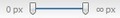 to filter the image display according to the defined resolution.
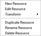
 (on the lower left of the window).