|
Adding a "Menu Button" Control to a Screen |
  
|
Adding a "Menu Button" Control to a Screen
|
Adding a "Menu Button" Control to a Screen |
|
Control Purpose
This control is used to display a menu with several option buttons that will enable the redirection to the required programs. The called element (screen, routine out or routine) must end with a "Go to: <Exit>" to ensure the execution flow returns to the screen that includes the "Menu Button".
If your MCL-Designer V4 subscription includes Speech attributes, it will affect the "Menu Button's" use - this control will also accept speech input (operator speaking into the device).
Add a button menu to a screen by dragging a "Menu Button" control  from the top section of the "Control" tab OR the "Style Preview Section" onto the screen.
Step-by-step
1. Drag the control onto the screen:
•If dragged from the "Control" tab, the control will assume the default style. (See Set Default.)
•If dragged from the "Style Preview Section", it will assume that particular style.
2. Now, double-click the selected control on the screen OR the tree view to open the properties window.
 For a better understanding of this specific control, create a "Menu Button" by following the choices/values displayed throughout the images in our step-by-step.
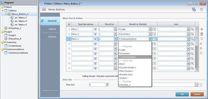
The "General" tab is open by default.
In the "Menu Text & Actions" table, each button from the "Menu Button"can be named and assigned a target location. Additionally, you can attribute a Keyboard shortcut key or add an image to each button.
Use the editing icons to the right of the "Menu Text & Actions" table to move the rows up and down and to delete or add more rows.
3. To name each button, go to the "Text/Variables" column and write directly on each row OR click the corresponding  and select a value within a variable. See Variable Definition.
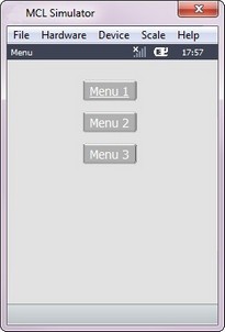
(Ex: "Menu 1", "Menu 2", "Menu 3")
4. If required, attribute a shortcut key in the keyboard of the device for each button.
("L", "I", "C")
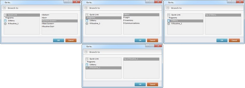
5. Define the target location for each of the buttons in the control by selecting from the respective drop-down list OR by clicking  . See Detail of a window below.
("P:Login"; "P:Inventory", "P:Communications")
Detail of a window
|
This window is an alternative to the drop-down list of destinations: a. Select a destination screen or routine within the same program as this control, in the left table. b. Specify the target even more by selecting from the table to the right. The available options are a consequence of your choice in the left table. c. If you want to add other processes to the execution flow instead of defining a target with a Go to process, select the "<Action>" option. d. Finish this operation by clicking |
 The function of this control is, usually, to send the operator to a particular screen after a "Change" event. This means that a "Go To" process is necessary to enable an action (to deploy to a specific location such as "Exit", "Next Screen", etc.) triggered by that event. If the target location for the "Change" event is specified here, it will not be necessary to add a "Go To" process in the "Actions" tab.
6. As a further option, you can add an image inside each button.
 Click Here to View Details on Clicking
If you click
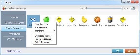
This window allows you to control the displayed images:
•Click
•Use
Right-clicking an existing image resource, opens a menu with several options. The available options vary according to the resource's location (the tab that includes the selected image). Below are all the possible options:
a. Open the tab that contains the required image.
b. Select the image.
c. Click
|
Click Here to View details on Importing an Image
Instead of selecting an image from the available tabs, you can import the required image from an outside source:
a. Click
b. Browse for the required image in an OS browse window and select it.
c. Click
No matter which tab you had open when you clicked
d. In the "Project Resources" tab, select the image you have imported.
e. Click
|
Instead of selecting an image, you can enter a relative path, in the "Icon" column, to refer the image file(s) you want to add to the "Menu Button" (see Working with Aliases) OR simply drag an image from an OS browse window and drop it in the "File" field.
An "Exit" option is recommended (in the device's target screen) to allow the operator to return to the calling screen. This is best achieved by using a "Button" or "SoftKey" control.
7. There is an advanced option regarding the image element that allows you to rotate or flip the selected image:
If required, right-click each "Icon" field to access the "Advanced Image Settings" option and follow the steps described in The Display of a Control's Image Element.
8. If required, define the time out (in seconds) in the "Time Out" option. If you maintain the default value "0", there is no time out defined.
9. If a time out is established, a target location must also be defined. Select a destination in the "Go to" box from the drop-down list or by clicking .
The definition of a time out will affect the screen that contains the "Menu Button". If there is no screen activity after the time out, the target location that is determined in the "Go to" option will automatically be called.
10. Go to the "Layout" tab.
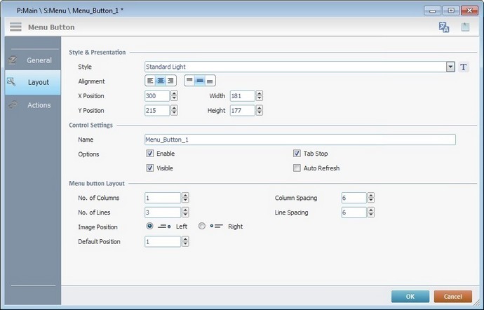
11. Define the control's style by selecting an option from the drop-down list or by clicking  . See Editing and Creating Styles and Editing and Creating the "Menu Button" Style.
(ex: "Standard Grey")
12. Position the text/value, within the control, with the alignment buttons.
(ex: centered alignment)
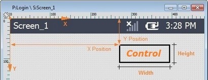
13. Maintain the given values or specify the control's position/size, within the screen, by providing the "X" and "Y" coordinates as well as "Width" and "Height".
Detail of Position/Size values
14. In the "Control Settings" section, attribute a name to the control. This name is displayed in the tree view.
(ex: "Menu_Button_1")
15. Consider whether or not to check the following options:
"Enable"
Activates the control's input feature.
"Tab Stop"
Must be checked to enable a "Change Tab Order". This provides the possibility to change the order (between data input controls) in which the information is keyed in by the operator.
"Visible"
Controls the controls's visibility in the device's screen.
(ex: All options checked)
"Auto-Refresh"
Enables an automatic update of the visible information, every time the value of the variables used is modified.
16. In the "Menu Button Layout" section, either maintain or define the following values:
"No. of Columns"
Defines the number of columns to distribute the existing buttons. (ex: 1)
"Column Spacing"
Defines the space between the columns. (ex: 3)
"No. of Lines"
Defines the number of rows to distribute the existing buttons. (ex: 10)
"Line Spacing"
Defines the space between the lines. (ex: 10)
"Image Position"
Controls the position(Left/Right) of the image (selected in the "General" tab) inside the button. (ex: Left)
"Default position"
Defines the button that is highlighted in the control. (ex: 1)
17. If the target location for the "Go to" process has already been defined, end the addition of a "Menu Button" operation by clicking  .
.
If the "Go to" option in the "General" tab was left unfilled, continue to step 18.
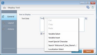
Use the right-click in MCL-Designer's input boxes to access some related options as well as the general "Cut"; "Copy"; "Paste"; "Search"actions (active/inactive according to the current context).
Ex: If you right-click the "Text Data" input box (included in a "Display Text" properties window), you are provided with the general editing/search actions and other specific options such as "Variable Select" (see "Variable Select") ;"Variable Insert" (see "Variable Insert"), "Insert Special Character" (see To Insert Special Characters into a Control's Text Input Field) and "Localization Select" (see Localization List).
If you right-click any other input box, it may provide other possibilities.
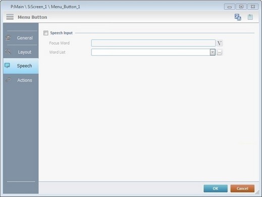
Speech Feature If your MCL-Designer V4 subscription includes Speech attributes, you will have access to an extra tab - "Speech"- where you can define this control's speech possibilities.
All speech related options within this control are explained in another topic - see Speech in the "Menu Button" Control. Once you have gone through the topic, use the provided link to return to this step-by-step and continue to the "Actions" tab (step 18).
If your MCL-Designer V4 license does NOT have Speech attributes, the next tab is the "Actions" tab. Continue to step 18. |
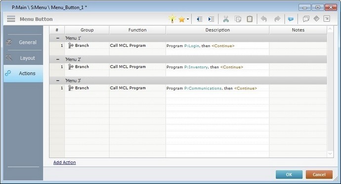
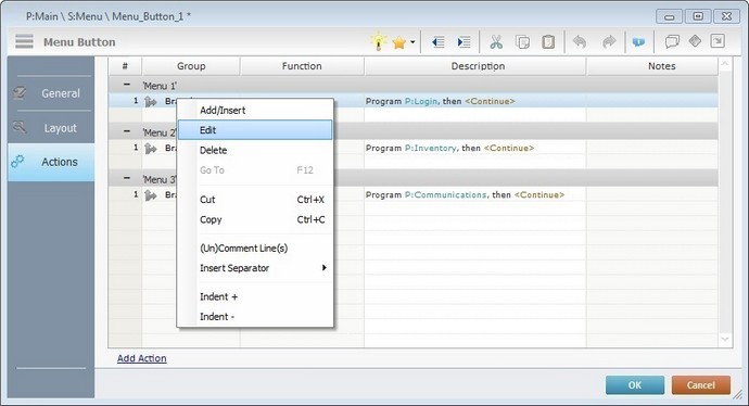
Keep in mind there must be an event attached to the control and an objective for that event. This control is an exception because you have to define an objective/target location for each button included in the "Menu Button".
By default, the Menu Button control already contains a process for each button attached to the "Click" event (exceptionally termed "Menu #" within this control). The displayed process depends on your choices in the "General" tab.
Ex: The target destinations selected in the "General" tab consisted of programs within your project. Therefore, the default process for each menu button is a "Call MCL Program" with the corresponding destination.
19. To edit each process included in the "Menu Button", double-click the corresponding process OR right-click the desired process and select "Edit..." in the resulting menu. Either of these choices opens the corresponding process window. See Editing Processes.
20. If required, double-click the empty line below the event or click  in the Editing Bar to add process to each menu included in the "Menu Button". See Adding Processes to a Screen or a Control.
21. If there is no need to add more events, click in the "Actions" tab to conclude the operation. If the project requires more events (the "Menu Button" control also has the "Change" event available), proceed to step 22.
22. Click  (at the bottom of the "Actions" tab) to add a new event.
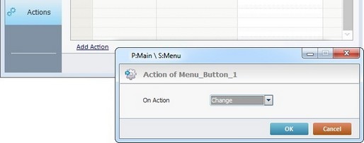
This control has predefined local variables (only available in event context). See Menu Button's Predefined Local Variables.
23. Double-click the empty line below the event or click in the Editing Bar to add process to each menu included in the "Menu Button". See Adding Processes to a Screen or a Control.
If you have more than one event, remember to select the event row you want to add processes to.
If you use the drag-and-drop method to add processes, make sure to drop the process on a row below the intended event.
Before concluding the addition operation, check the following:
Remember that the "Enable" option (located in the "Layout" tab) must be checked so that the added actions/processes run.
24. If required, use the icons located on the upper right corner of the properties window:
Click this icon to open a "Localization" window where you can edit the text element within that control or add translations to it. See Localization.
Click this icon to attach any relevant notes to this control. Enter your text in the resulting window. This information is displayed in the "Developer report". See Report.
25. Click in the "Actions" tab to apply the choices made.
The "Menu Button" has been successfully added to the screen.
To activate an instant "Edit Text mode", select the "Menu Button" and press the <space> key. When you are done editing the control's text element, press <Enter> or click outside the control's area to set it back to "view" mode.
If any subsequent edition of the control's properties is required, double-click the "Menu Button" OR select "Edit" (in its right-click menu) to open the properties window.
If you want to view this control applied within an application, see Sample Applications.
Menu Button's Predefined Local Variables
This control has predefined local variables (only available in event context).
Event |
Change |
|
Variable Name |
L_Control_Name |
L_Line_Number |
Variable ID |
&0a |
&1a |
Description |
Stores the control's name (*) |
Stores selected field number |
* Defined in the control's properties window ("Layout" tab).
 and select the most appropriate view ("Large Icons", "Medium Icons" and "Small Icons").
 to filter the image display according to the defined resolution.
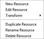
 (on the lower left of the window).