|
Adding a "Radio Button" Object to a Screen |
  
|
Adding a "Radio Button" Object to a Screen
|
Adding a "Radio Button" Object to a Screen |
|
Object Purpose
This object is used to allow the operator to define data by selecting it from a fixed list. The selected data is stored in user variables and can, then, be further processed or stored. See Variable Definition.
Add a radio button to a screen by dragging a "Radio Button" object  from the top section of the "Control" tab OR the "Style Preview Section" onto the screen.
Step-by-step
1. Drag the object onto the screen:
| • | If dragged from the "Control" tab, the object will assume the default style. (See Set Default.) |
| • | If dragged from the "Style Preview Section", it will assume that particular style. |
2. Now, double-click the selected object on the screen OR the representation in the tree view to open the "Properties" window.
The "General" tab is open by default.
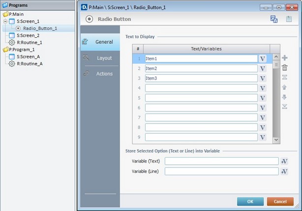
3. In the "Text/Variables" table, define the name of each radio item. Either enter the name of each radio item in the corresponding box OR click each  and select a variable with the intended value. See Variable Definition.
Use the editing icons to the right of the table to move the rows up and down and to delete or add more rows.
4. Define the variables that will store text and line values. Click  to create/select the corresponding variables for each value. See To Select/Create a Variable.
5. Go to the "Layout" tab.
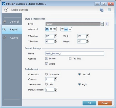
6. Define the object's style by selecting an option from the drop-down list or by clicking  . See Editing and Creating Styles and Editing and Creating the "Radio Button" Style.
7. Position the values, within the object, with the alignment buttons.
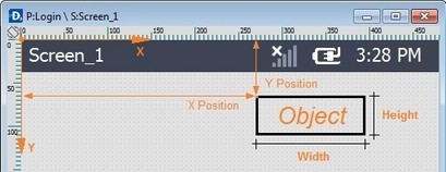
8. Maintain the given values or specify the object's position/size, within the screen, by providing the "X" and "Y" coordinates as well as "Width" and "Height".
Detail of Position/Size values
9. In the "Control Settings" section, attribute a name to the object. This name is displayed in the tree view.
10. Consider whether or not to check the following options :
"Enable"
Activates the object's input feature.
"Tab Stop"
Must be checked to enable a "Change Tab Order". This provides the possibility to change the order (between data input objects) in which the information is keyed in by the device operator.
"Visible"
Controls the object's visibility in the device's screen.
11. Define the "Radio Layout":
"Orientation"
If the "Horizontal" option is checked, the number of lines can be defined.
If the "Vertical" option is checked, the number of columns can be defined.
"Text Position"
Decide whether the text should be to the"left" or the "right" of the radio button.
"Default Position"
Defines the row that is highlighted.
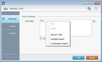
Use the right click in MCL-Designer's input boxes to access certain features regarding the input box's option as well as general actions such as "Copy"; "Paste"; "Search".
Ex: If you right-click the "Text Data" input box (included in a "Display Text" properties window), you are provided with the "Paste", "Search..." and "Variable Select" options.
If you right-click any other input box, it will provide other possibilities.
12. Go to the "Actions" tab.
Keep in mind there is always a default event (ex: "On Change"; "On Timer"; "On Hotkey"; etc.) attached to the object (in this case, an "On Change" event). If you want the event to trigger an action, you must add processes to it (ex: "Go To"; "Check File"; "Set Focus"; etc.).
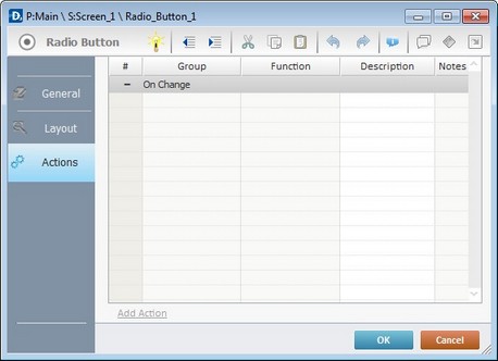
13. To edit the event, double-click the event row ("On Change") OR right-click the event row and select "Edit..." in the resulting menu. Either of these choices opens an "Edit Event" window.
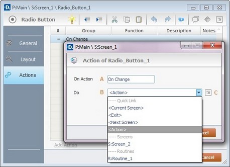
14. Select from the drop-down (B) or  (C) list:
A |
This event, performed by the device operator, is the "trigger" that enables an action to advance the application. It cannot be modified. Default event: "On Change" - Is triggered when the operator enters data via the "Radio Button" object. |
B |
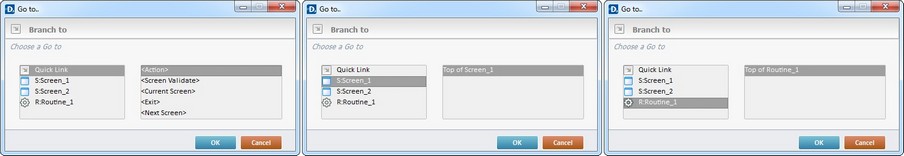
Provides targets for a "Go to" action (see Working with the Branch Processes Group). After the device operator has fulfilled the "On Change" event, the workflow will proceed to the selected destination. If you want to add processes other than a "Go to", select the <Action> option. |
C |
Provides quick links for a "Go to" action ("Next Screen"; "Exit"; etc.) to be executed when the event is fulfilled. See Detail of a |
Detail of a window
|
This window is an alternative to the drop-down list of destinations. Select a destination screen or routine within the same program as this object, in the left table. Specify the target even more by selecting from the table to the right. The available options are a consequence of your choice in the left table. If you want to add more processes, select the <Action> option. Finish this operation by clicking |
15. If required, add processes to the event. See Adding and Editing Processes.
This object has predefined local variables (only available in event context). See Radio Button's Predefined Local Variables
Before concluding the addition operation, check the following:
Remember that the "Enable" option (located in the "Layout" tab) must be checked so that the added actions/processes run.
If required, use the icons located on the upper right corner of the "properties" window:
Click this icon to open a "Localization" window where you can edit the text element within that object or add translations to it. See Localization.
Click this icon to attach any relevant notes to this object. Enter your text in the resulting window. This information is displayed in the "Developer report". See Report.
16.Click  in the "Actions" tab to apply the choices made.
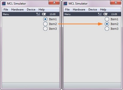
The "Radio Button" object has been successfully added to the screen
If any subsequent edition of the object's properties is required, double-click the "Radio Button" OR select " 'Radio Button' Properties" (in its right-click menu) to open the properties window.
Radio Button's Predefined Local Variables
This object has predefined local variables (only available in event context).
Event |
On Change |
||
Variable Name |
L_Control_Name |
L_Field_Value |
L_Line_Number |
Variable ID |
&0a |
&1a |
&2a |
Description |
Stores the object's name (*) |
Stores selected field value (**) |
Stores selected field nbr |
* Defined in the object's "properties" window ("Layout" tab).
** Defined in the object's "properties" window ("General" tab).