|
Dashboard in Live Mode |
  
|
Dashboard in Live Mode
|
Dashboard in Live Mode |
|
Overview
The Live Mode of a dashboard is the operational view, meaning, the dashboard (with its widgets) is displayed in a screen to relay data, in real time, so that the authorized personnel can monitor/analyze the information.
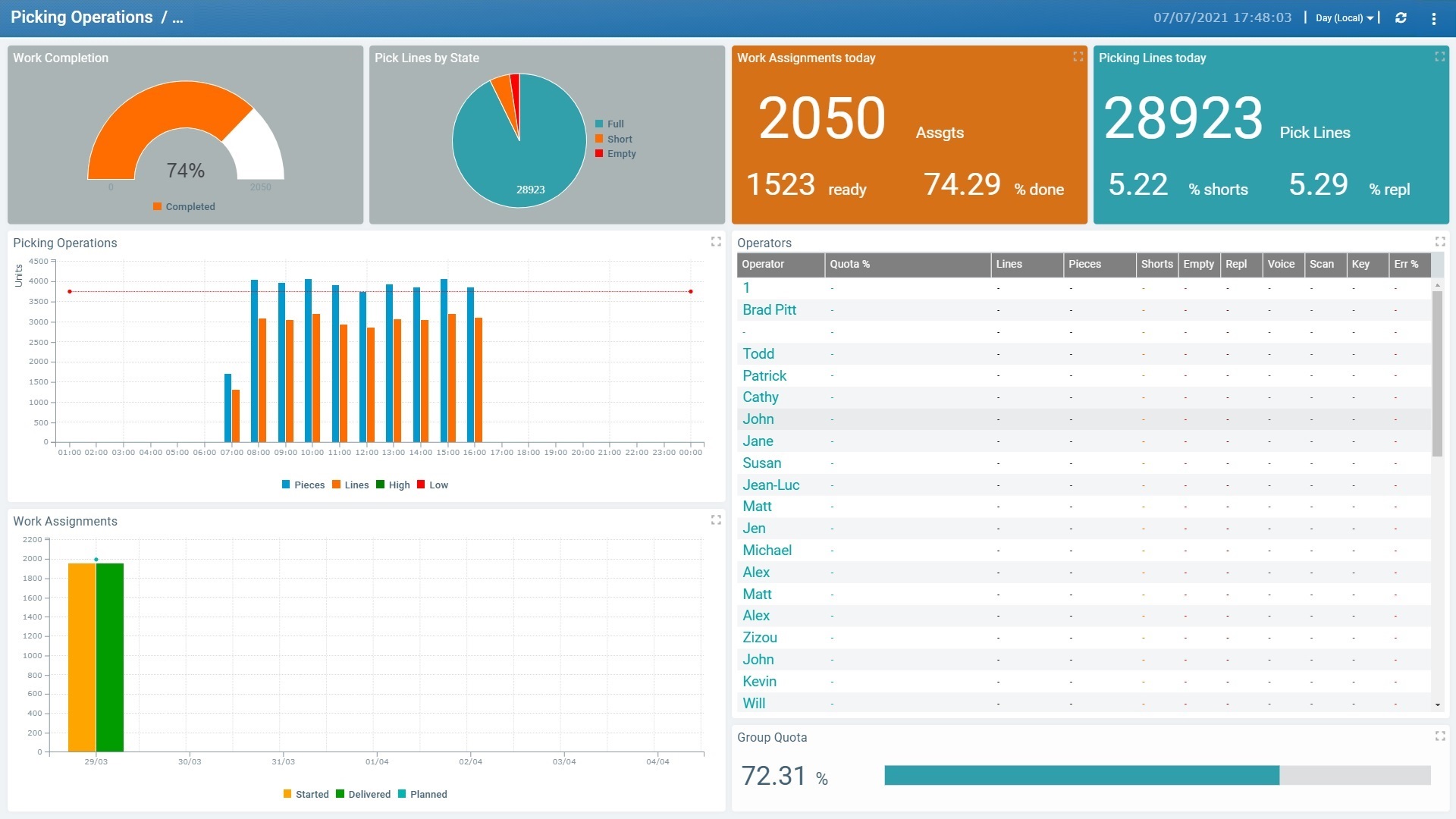
It does NOT include the editor settings/options contained in a dashboard's details page (ex: "Add Widget" option, "Dashboard Properties" tab, ", etc.) but there are a few options available in the dashboard's header:

Resolution drop-down |
You can organize the displayed values per "Hour", "Day (Local)", "Day (UTC)", "Week (Day (UTC))", "Week (Day (Local))" or "Month".
If the current site has a Time Period profile associated to it, the drop-down will also display the time periods that are included in it. |
|
Is used to, manually, refresh the display. |
|
Is a menu with the following options:
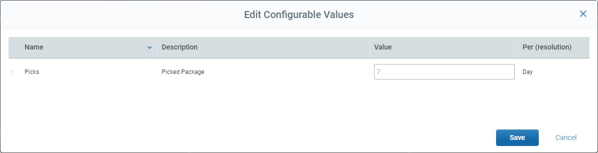
"Edit Configurable Values" - This option allows you to change the value of the "configurable value". See Details on Editing the Value of the "Configurable Value" below. "Zoom" - This option provides a list of zoom percentages and you can select the most appropriate one. The default option is "100%". "Fullscreen" - Selecting this option expands the dashboard's details page to a full screen. To return to the default view, click <ESC> in your PC keyboard or select this option again (in this case, the option will have a |
It is possible to configure specific values to create performance indicators (=KPI) to be used within a dashboard. They are created in each dashboard in the form of a "Configurable Value". See Configurable Values.
If required, you can edit the value of the "configurable value" with the "Edit Configurable Value" option. It will affect the dashboard's widgets that use the selected "configurable value". For instance, if you establish a specific value to represent a daily goal but, for some reason, you want to change that goal for a day, you can use this option to expose the data with this new objective. The originally configured value is still valid/not lost but you are able to view the data you want, for a period of time, and, then, revert back to the original daily goal. All the other properties (ex: name, resolution, etc. ) CANNOT be edited here.
Click the "Edit Configurable Value" option (which is part of the
This pop-up window lists the dashboard's already created "configurable values" that are editable. The provided information has been configured in the "Dashboard's Configurable Values" and it is NOT editable here, except for the "Value" column.
|
||||||||||||
Access to a Dashboard in Live Mode
This Live Mode can be accessed by a platform user:
▪by clicking the ![]() button (available in every dashboard's details page when in edit mode) - it opens a new tab with the dashboard in Live Mode.
button (available in every dashboard's details page when in edit mode) - it opens a new tab with the dashboard in Live Mode.
▪by clicking the dashboard name (displayed in light blue) in the "Dashboard Management" page.
When a dashboard is shared with other collaborators via an autonomous link (does not require login), the dashboard they have access to is also in Live Mode. See Sharing a Dashboard.
Available Options in a Dashboard in Live Mode
The Live Mode allows you to "manipulate" some of the displayed data. The available options depend on the type of widgets included in the dashboard.
•Clicking ![]() (upper-right corner) of any widget, maximizes it/places it forward.
(upper-right corner) of any widget, maximizes it/places it forward.
Simply click ![]() (upper-right corner) to go back to a full dashboard view.
(upper-right corner) to go back to a full dashboard view.
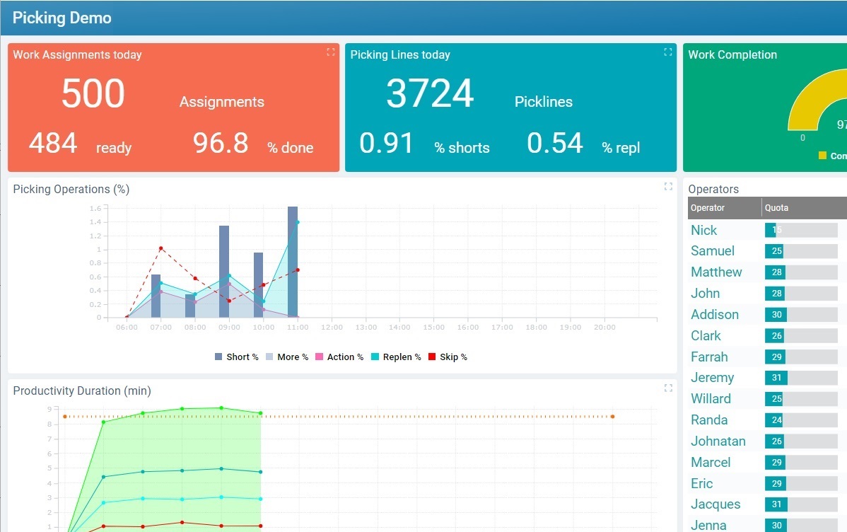
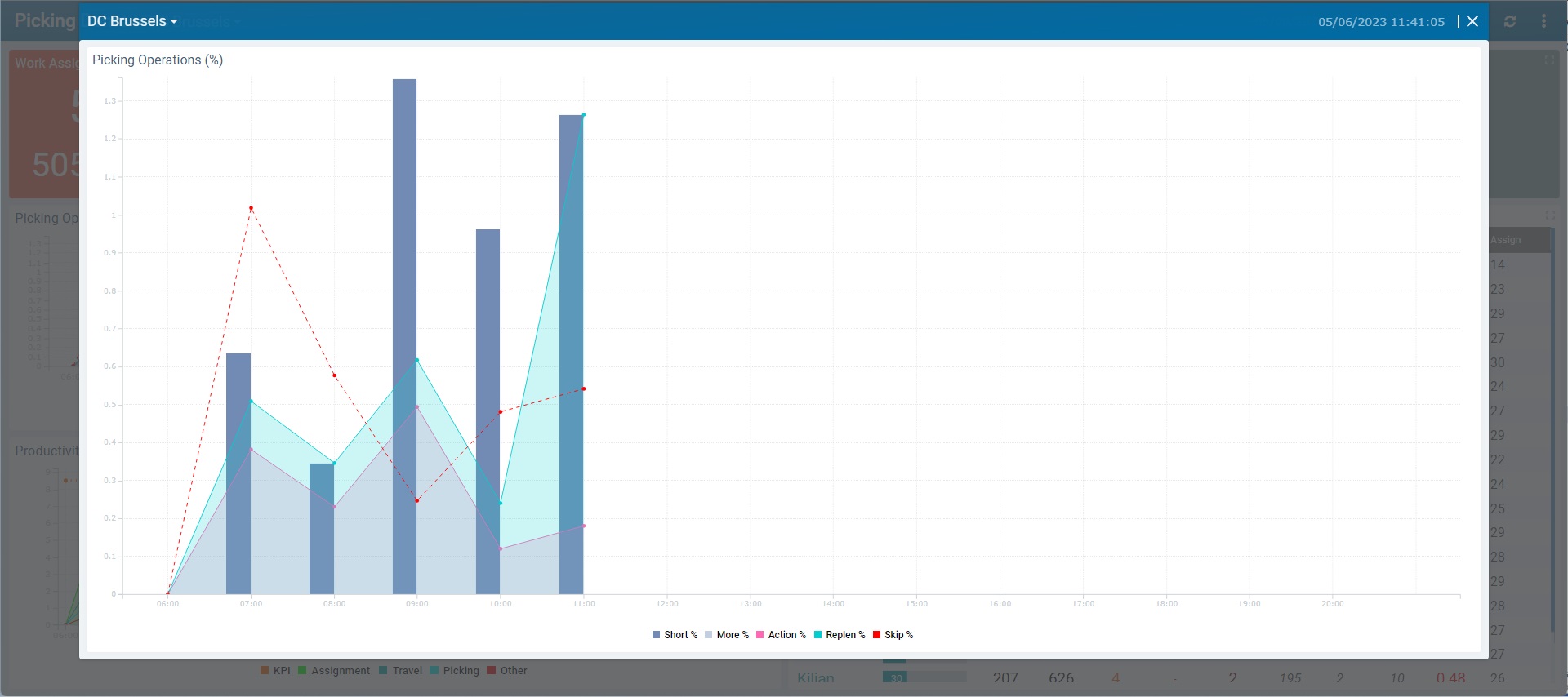
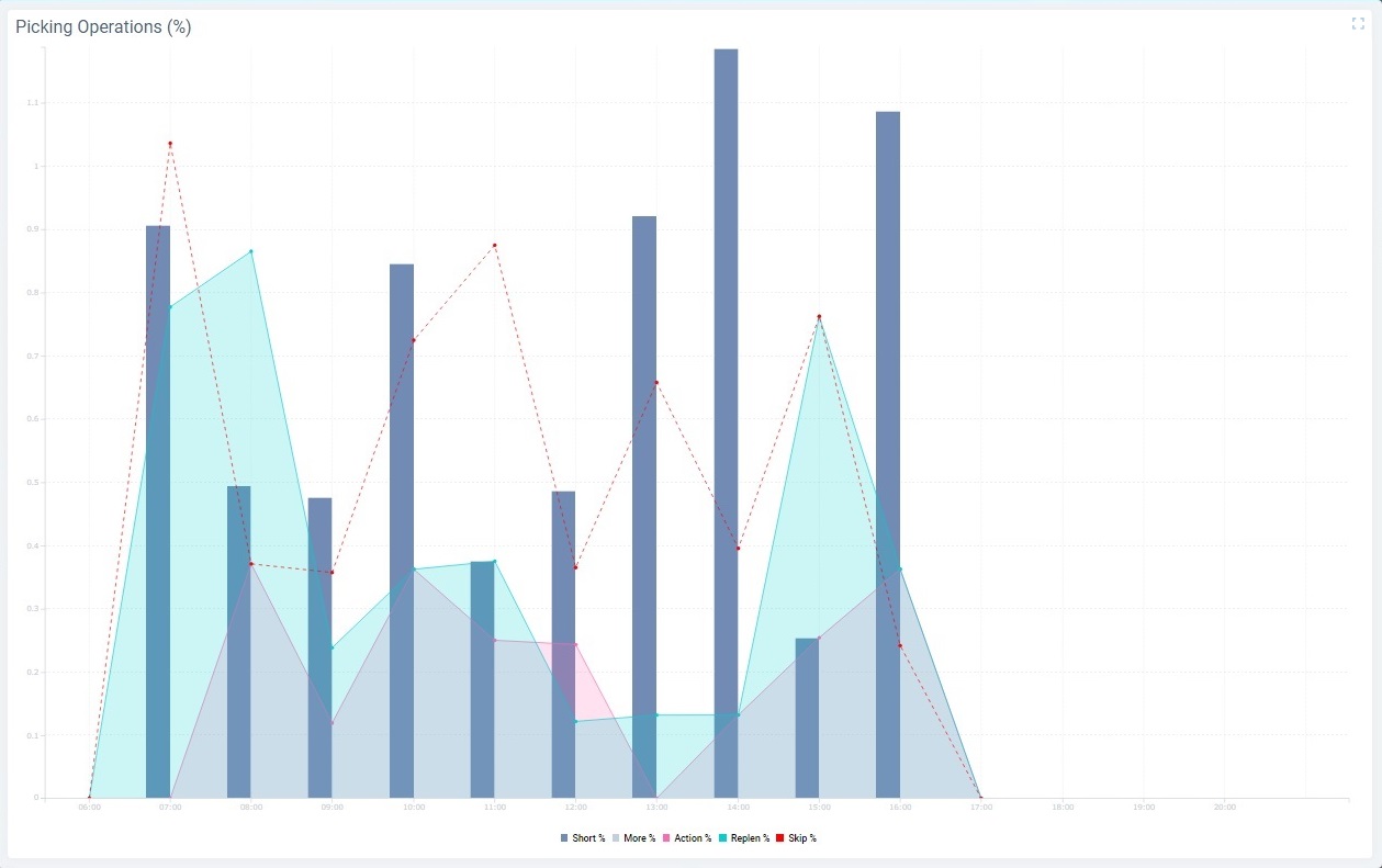
•Hovering the data area of a Pie Chart, Time Chart or Gauge widget opens a caption window with the values represented in the hovered area.
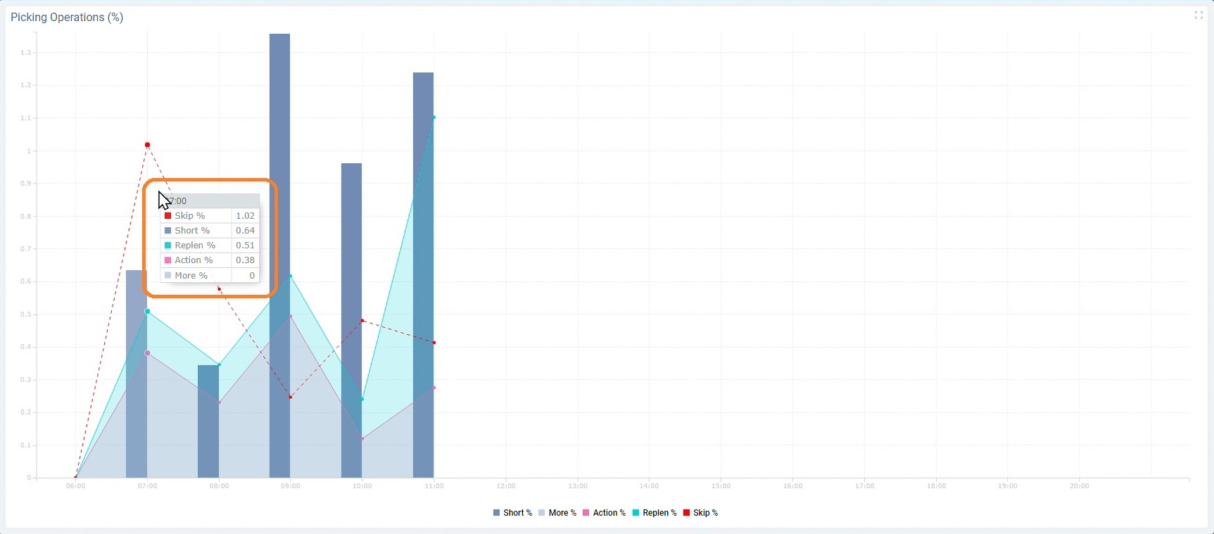
•Hovering a data series caption of a Gauge, Pie or Time Chart widget will make the corresponding data area stand out (the other series will fade).
Ex: Hovering the ![]() caption makes the corresponding bars stand out while the other series fade into the background.
caption makes the corresponding bars stand out while the other series fade into the background.
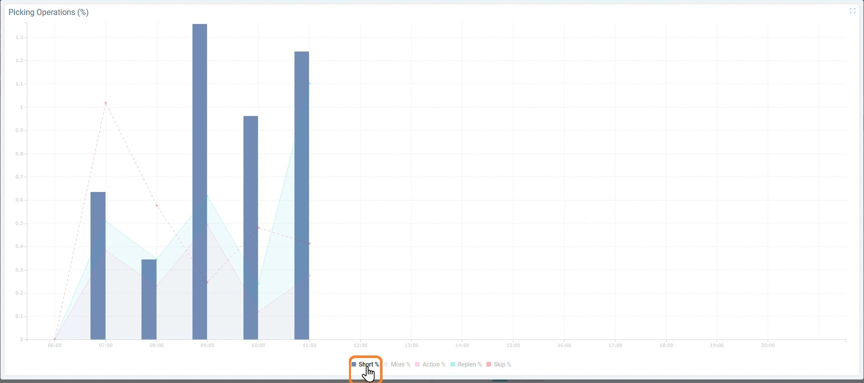
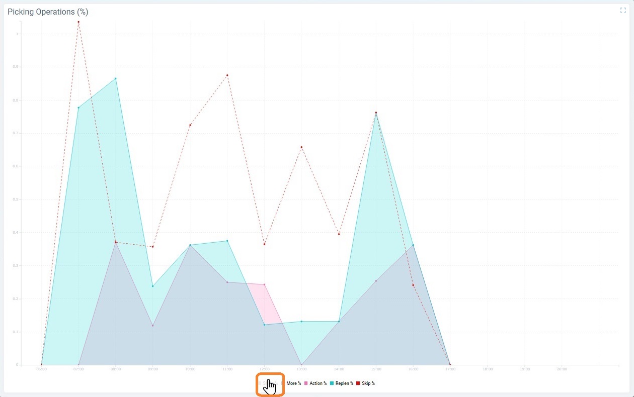
•Clicking a data series caption hides the corresponding series in the actual widget. When you click it again, the series becomes visible again. This is only valid for widgets with captions - the Gauge, Pie Chart and Time Chart widgets.
Ex.: Clicking the ![]() caption hides the corresponding bars that represent that series.
caption hides the corresponding bars that represent that series.
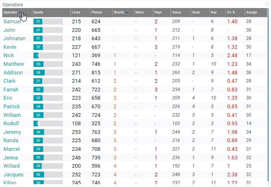
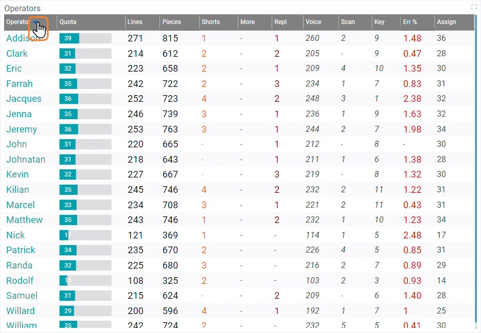
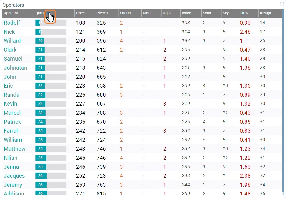
•Clicking a column header in a Datatable widget, sorts the data by that column.
Ex: View of a Data Table that has been sorted by "Operator" and, then, by "Quota".