|
Dashboard Details |
  
|
Dashboard Details
|
Dashboard Details |
|
Overview
A dashboard's details page displays its settings, provides several dashboard related options/operations and includes a Preview Section with the added widgets. If you select one of those widgets, you can also access the widget's own settings.
The page is organized as a dashboard editor (= set to edit mode) so you can edit the dashboards you create.
If, however, the dashboard was created at account level, its details page will ONLY open in view mode - those dashboards have been made available to all the account's sites and are NOT editable.
This topic illustrates a details page set to view mode (of a dashboard that was created at account level). For information on a details page set to edit mode (of a dashboard created within the current site), see Editing a Dashboard.
In the Site Dashboard's "Control Panel", click  , and, in the resulting row, click the
  sub-module.
This opens the "Dashboard Management" page with the available dashboards.
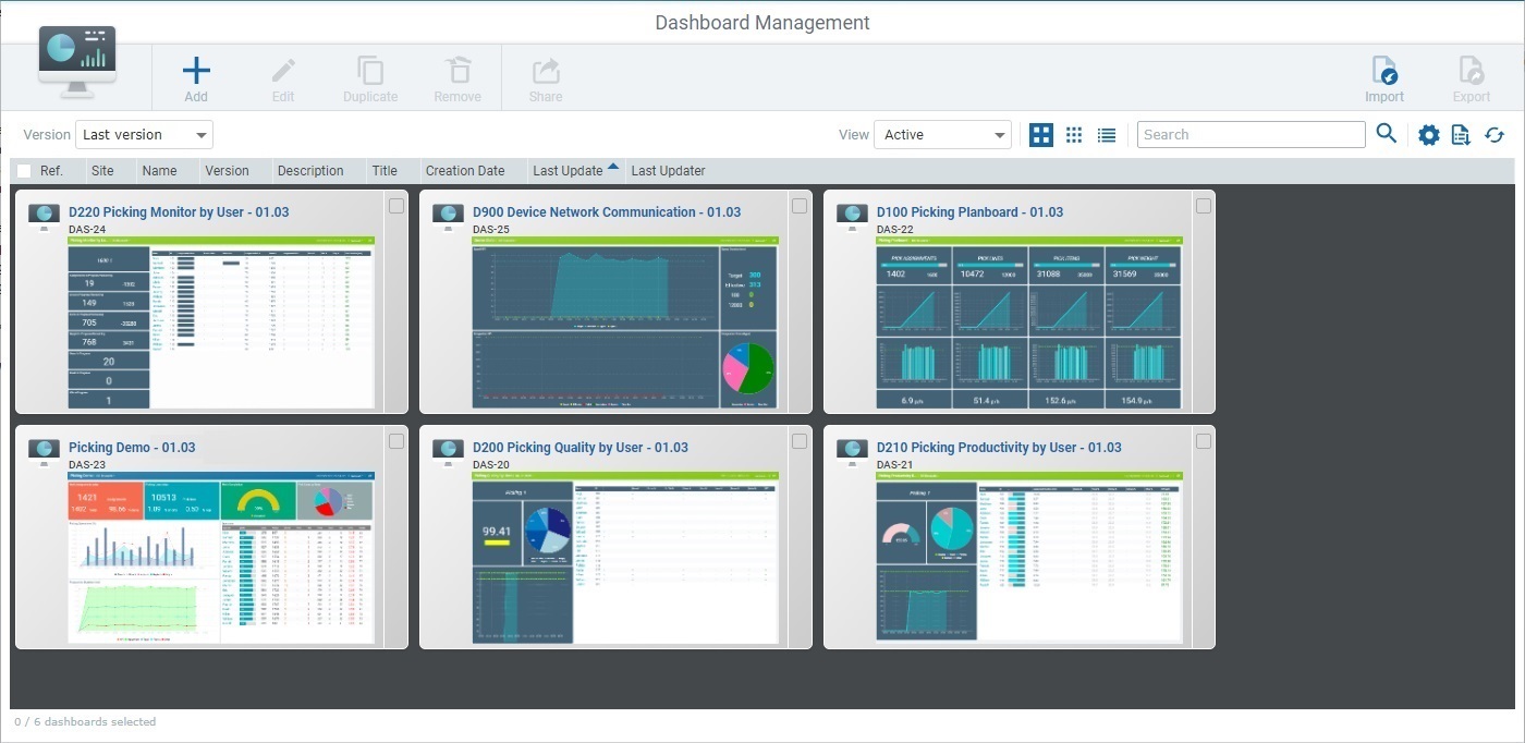
Select the intended dashboard by checking the corresponding  .
.
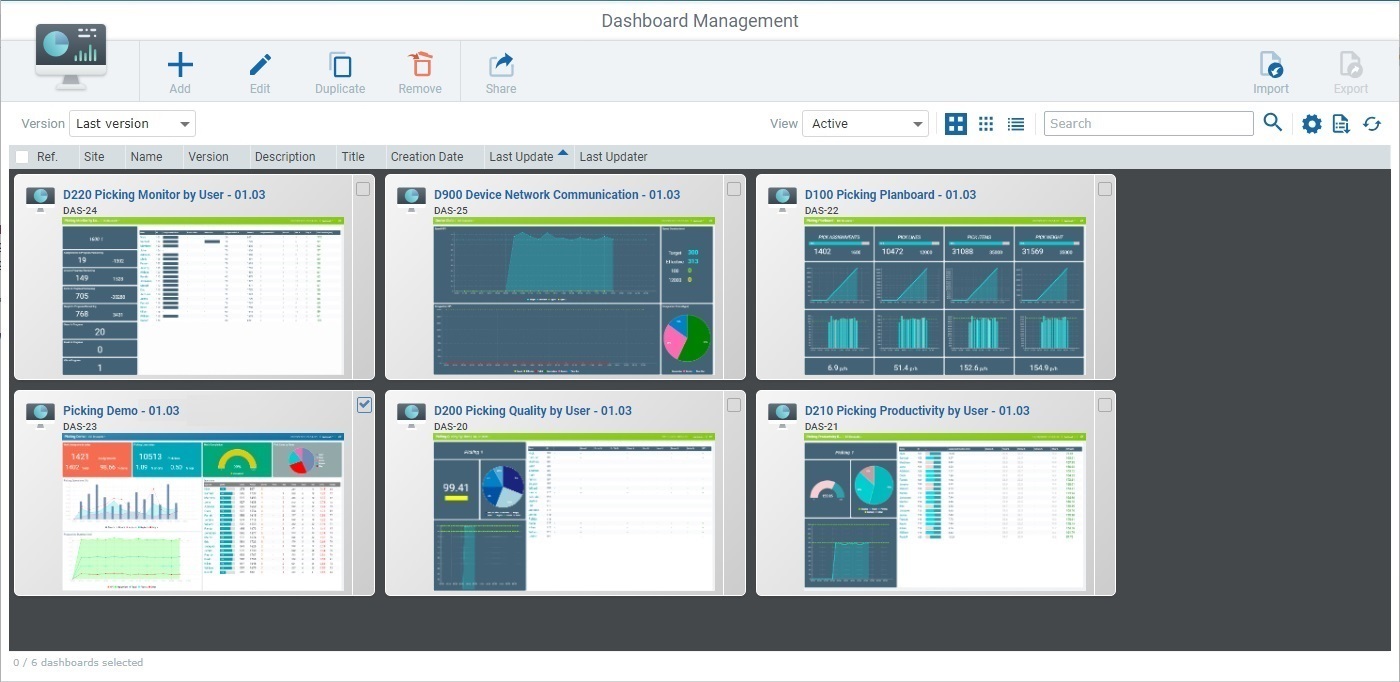
Click  - this button only activates when a dashboard is selected.
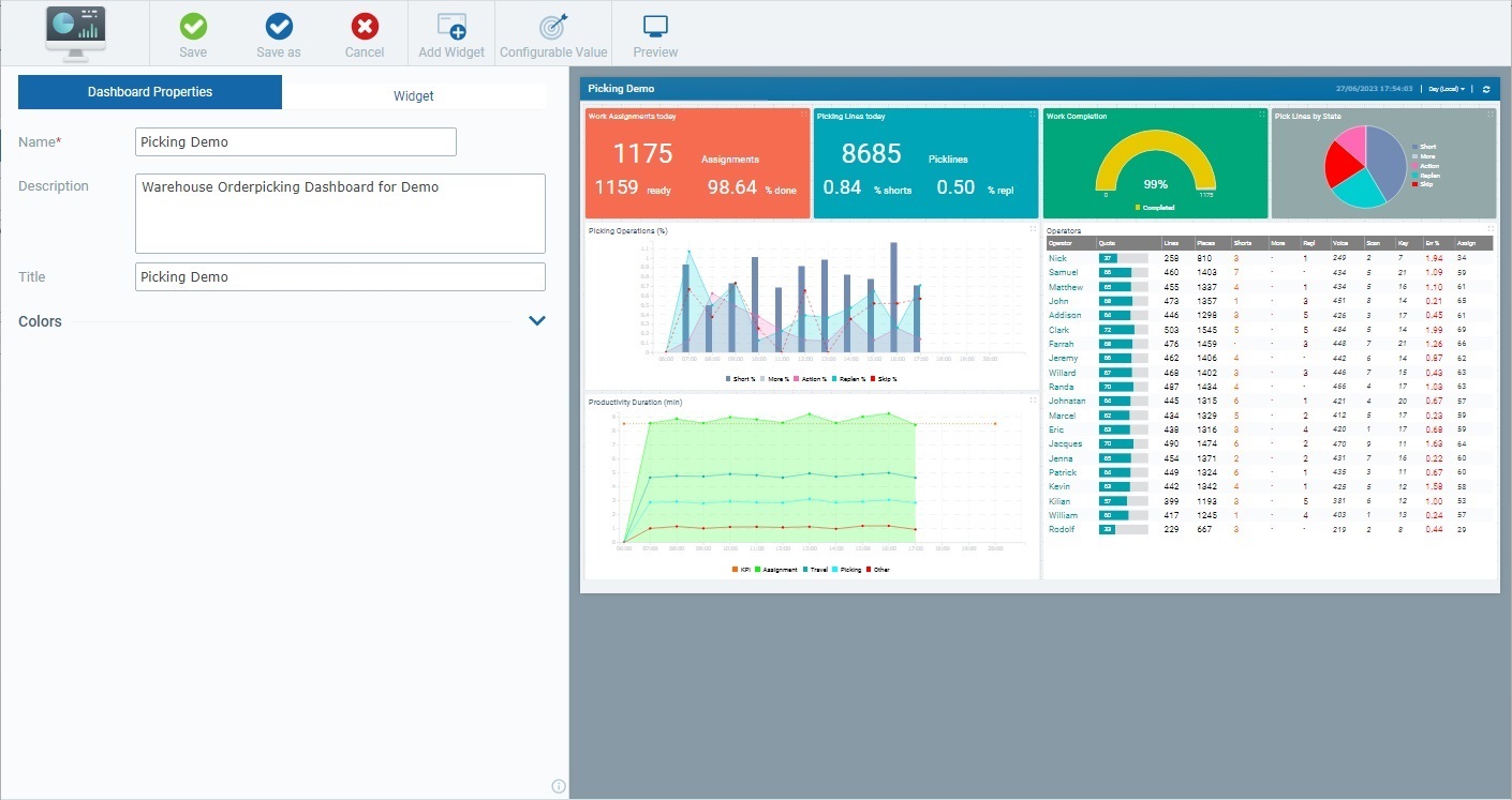
This type of details page includes 2 tabs and a Preview Section. The "Dashboard Properties" tab includes the current dashboard's settings/information and the other tab ("Widget") relates to the settings of the dashboard's widgets, specifically, the properties of the widget that is selected in the Preview Section. See Widgets.
We are going to focus on the "Dashboard Properties" tab and the Preview Section which provides a preview of the dashboard and what it contains.
"Dashboard Properties" tab
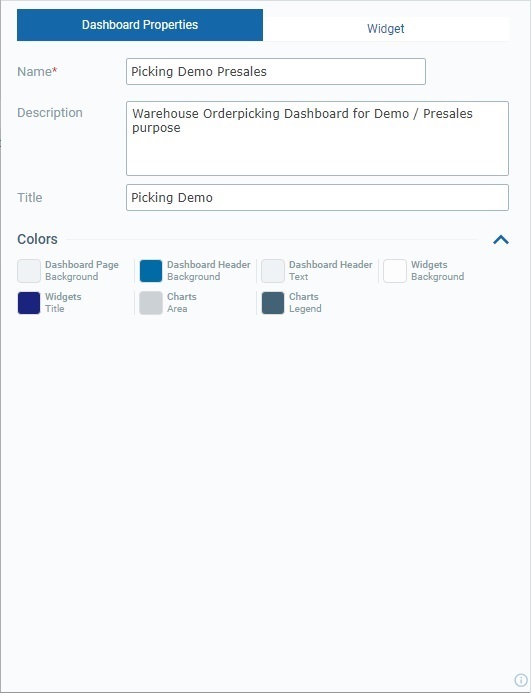
This tab provides information on the dashboard itself:
Name |
The dashboard's name - it identifies the dashboard within the account. It is NOT visible in the dashboard itself. You can mouse over the related
|
|||||||||||
Description |
Relevant information on the current dashboard. |
|||||||||||
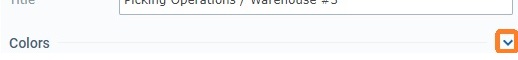
Title |
This title is displayed in the dashboard's upper left corner. This does NOT identify the dashboard (that is defined in the "Name" field). |
|||||||||||
Colors |
This section is responsible for defining the so called Global Colors, meaning, the colors of Dashboard elements (ex: background page, header background) and its widgets (ex: widget title color, widget background color). The widget related colors that are defined here are inherited, by default, by all the widgets included in the current dashboard. However, if required, you can customize the color of all or just certain widget elements. This customization is performed in the intended widget's own "Properties" and "Data" tabs. See Details on the Widget's "Colors" pop-up window.
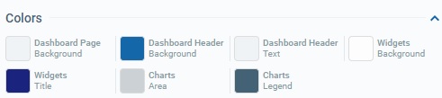
The section is organized as an accordion - click the arrow to the right to expand and view its content:
Available color related options:
See Details on the "Colors" Section below. |
It is possible to define the colors of the following Dashboard and/or Widget elements:
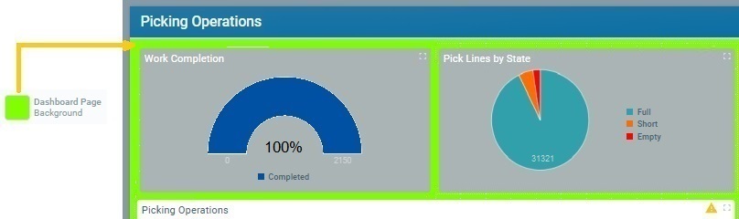
•Dashboard Page Background [Color of the background area of the current dashboard.]
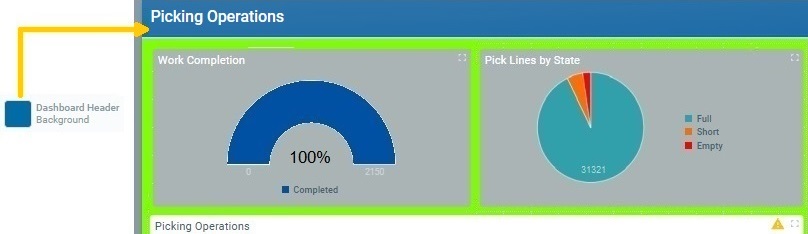
•Dashboard Header Background [Color of the background area of the current dashboard's header.]
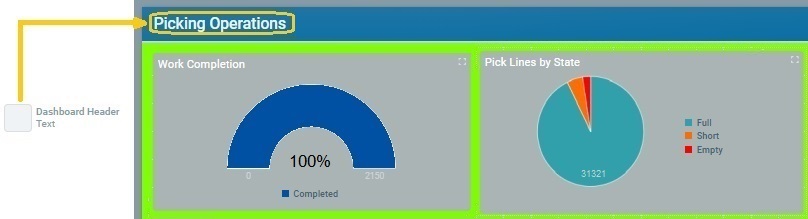
•Dashboard Header Text [Color of the text element of the current dashboard's header.]
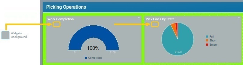
•Widgets Background [Color of the background area of all the widgets included in the current dashboard.]
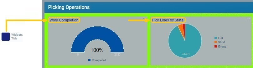
•Widgets Title [Color of the title of each widget included in the current dashboard.]
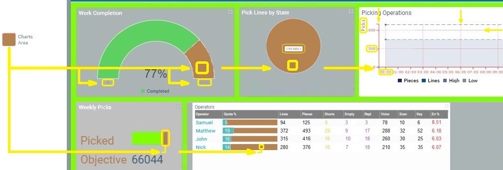
•Charts Area [Depending on Widget type, the color defined here can be adopted by a widget's displayed values, empty areas or grids/grid titles.]
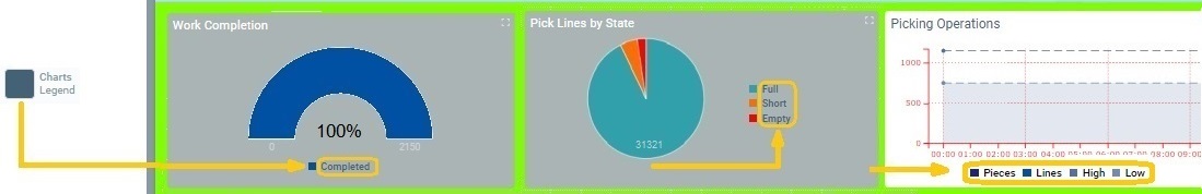
•Charts Legend [Color of the chart captions of each widget included in the current dashboard.]
|
 The colors defined here for widget elements are considered the "default" colors, at widget level. They are inherited by all the widgets whose elements have "default" as the defined color.
Preview Section
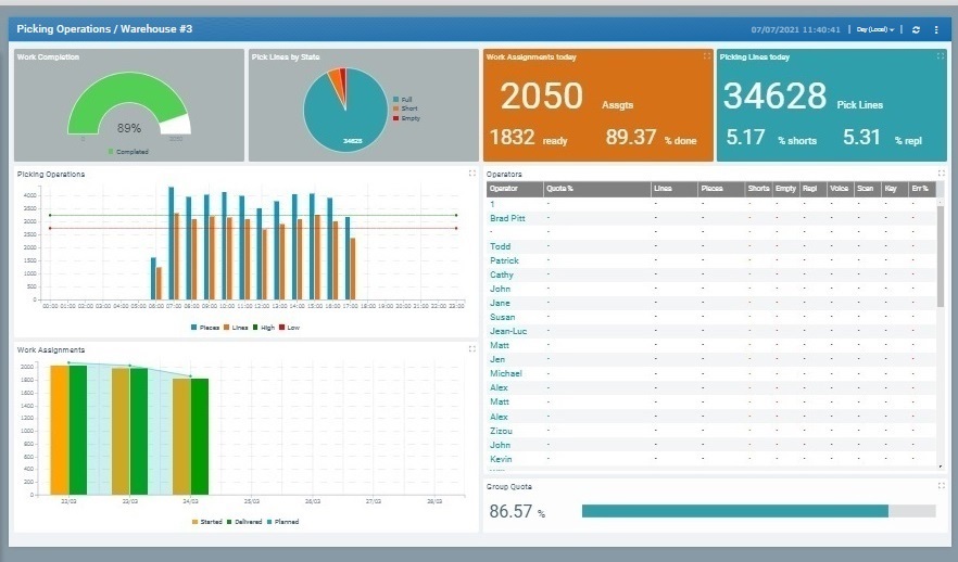
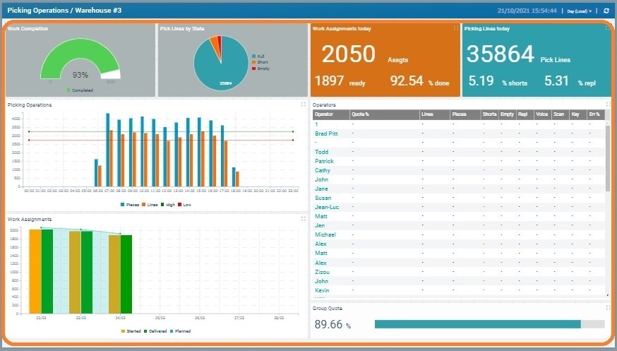
This section includes the visual aspect of a dashboard, meaning, it includes widgets and, basically, mirrors the dashboard display when you run the dashboard ( = Live Mode Dashboard).
Header Information |
|
|
[Dashboard Title]
This information is always placed in the header's left side. This is defined in the "Dashboard Properties" tab - "Title" field. |
Header Options |
|
|
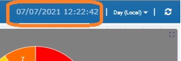
[Current Site's Local Date/Time] |
|
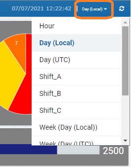
[Time Resolution related drop-down]
This drop-down defines how the information displayed in the dashboard's widgets is aggregated, resolution wise.
Time Resolution = a way to aggregate data into specific time periods.
By default, there are already established time periods, some adopting UTC time and others the current site's Local time - "Hour", "Day (Local)", "Day (UTC)", "Week (Day (UTC))", "Week (Day (Local))" or "Month".
This setting affects all the widgets that have been added to the dashboard with a time resolution set to "<Auto>". The exception is widgets with their own resolution.
In addition to these default time frames, you can also create other time periods to reflect specific working hours, for instance, and have the corresponding incoming data be aggregated according to those time periods. This requires creating a Time Period Profile that includes those specific time frames. See Creating a Profile. Once you create a Time Period Profile (with the time frames you need), those time frames will be listed in this drop-down. Ex: If you create a Time Period Profile with a time period called "Shift 2", that starts at 22:00 one day and ends at 08:00 the next day, the drop-down will also include the entry "Shift 2".
To make sure the defined time periods of the intended Time Period Profile are available in this drop-down, access the site's "Site Details" sub-module > "Time Period" tab and check what you have defined. |
|
[Refresh button]
The |
Widget Display Area |
|
|
[Display area]
This area incorporates the widgets that were added to the dashboard. The widgets are, automatically, receiving data and self-updating.
|
Widget Area |
|
|
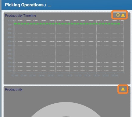
[Warning icons] If the settings of a widget have missing values/broken links, that widget will display small warning icons in its area, specifically, in the upper right corner. Mousing over the icon provides a message with more information. Ex: If a widget has a series with a counter as a data source, and one of its metrics has been deleted, the widget will display a warning icon in the upper right corner. When you mouse over the icon, you will get a message informing you there is a missing metric in a specific series. |
Dashboard Layout
The Preview Section allows you to define/edit the dashboard's layout, meaning, to arrange the added widgets and resize them, as necessary.
•Widget Positioning:
Click the intended widget, in the Preview Section, drag it to the intended position and drop it.
•Widget Resizing
Click the intended widget, in the Preview Section and use the mouse cursor to drag the widget's blue dots to expand or shrink the widget.
Use the mouse to re-dimension the widget within the dashboard. Once you select the widget, use the mouse cursor
Available Operations
To save any editions in the dashboard, click  OR
OR  . See The Dashboard Save Feature.
To cancel/discard unsaved changes, click  .
.
To add widgets to the dashboard, use the  option. See Adding, Editing and Deleting a Widget.
To duplicate a widget, use the  option and, then, edit the duplicate's details page. See To Edit a Widget's Properties.
This option is ONLY available in edit mode and after you have selected a widget in the Preview Section.
To delete a widget from a dashboard, click  . See To Remove a Widget from the Dashboard.
This option is ONLY available after you have selected a widget in the Preview Section.
To create "configurable values" to be used in the current dashboard (ex: as a widget's data source or within a widget's formula), click 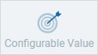 and proceed as described in How to Create a Configurable Value.
To access a preview of the current dashboard in Live Mode, click  . See Dashboard in "Live Mode".
 (tab's bottom right corner) to view dashboard information:
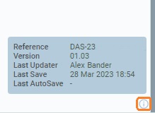
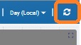
 button is used to, manually, refresh the display of the widgets contained in the dashboard.