Adding a "Display Image" Object to a Screen |
  
|
Adding a "Display Image" Object to a Screen |
|
Object Purpose
This object is designed to add an image to a screen.
All the images used within the project are stored in the "Resources" module. The added image can be used as a background for the screen because it always positions itself behind the other objects in that screen.
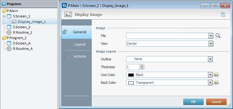
To add an image, drag a "Display Image" object  on to the screen. At this stage, there is still no image displayed, there is only an empty area within the screen. The "Display Image" object only displays an image after one is selected in its properties window (in the "General" tab, "File" option).
If there is no image selected in the "Display Image" object, an error icon  is displayed in its place, on the screen. The "File is missing" error message also appears in the corresponding "Properties" window.
Step-by-step
1. Drag the object from the "Control" tab onto the screen.
2. Now, double-click the selected object on the screen OR the tree view representation to open the "Properties" window.
The "General" tab is open by default.
3. In the "File" option, define the image to be used in the object.
Either select it from the drop-down list (which displays the project's image resources) OR click  and select an image from the available tab options ("Theme", "Designer Resources", "Project Resources", "My Pictures" and a tab representing the folder you previously used as a source for an image import. In the case of the image below, it is the "C:\...\Pictures\" tab).
If you click , you open the following window:
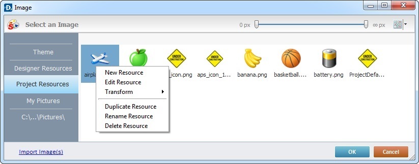
This window allows you to control the displayed images:
•Click  and select the most appropriate view ("Large Icons", "Medium Icons" and "Small Icons").
•Use  to filter the image display according to the defined resolution.
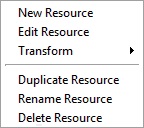
Right-clicking an existing image resource, opens a menu with several options. The available options vary according to the resource's location (the tab that includes the selected image).
Below are all the possible options:
|
New Resource |
Opens an OS browse window. Browse for an image, select it and import it into the tab that is currently open. |
Edit Resource |
Opens your default image editor. Edit the selected image. |
|
Transform |
Allows you to rotate (90o, 180o or 270o) or flip (horizontally or vertically) the selected image file. |
|
Duplicate Resource |
Duplicates the selected image. The duplicate has the same name as the original resource plus an incremented number. |
|
Rename Resource |
Sets the image's name into "edit" mode. Enter the new name and click <Enter> in your PC keyboard. |
|
Delete Resource |
Deletes the selected image. Click |
a. Open the tab that contains the required image.
b. Select the image.
 To avoid any display issues, make sure that the dimension of the selected image resource and the Display Image's area are the same.
c. Click  to apply and return to the "general" tab.
Instead of selecting an image from the available tabs, you can import the required image from an outside source:
a. Click  (on the lower left of the window).
b. Browse for the required image in an OS browse window and select it.
c. Click  to import the image.
No matter which tab you had open when you clicked , the imported image is placed in the "Project Resources" tab.
d. In the "Project Resources" tab, select the image you have imported.
e. Click to apply and return to the "General" tab.
Alternatively, you can enter the path (relative or absolute) to locate the image file you want to add to the "Display Image" object. See Working with Aliases.
4. There is an advanced option regarding the image element that allows you to rotate or flip the selected image:
If required, right-click the "File"option to access the "Advanced Image Settings" option and follow the steps described in The Display of an Object's Image Element.
5. Define how the image should be displayed in the "View" option by selecting from the drop-down list:
"True Size"
Enables the viewing of the image in its true size. Make sure that the "Display Image" object's area matches the size of its content.
"Center"
Centers the image within the area of the "Display Image" object.
"Stretch"
Enables the stretching of the image.
"Fit to Area"
Displays the image to fit the area of the "Display Image" object.
"Tile"
The image is displayed in a tile format.
6. Define the image layout by filling in/selecting various options:
"Outline"
Select an option from the drop-down list ("Simple"; "Double"; "Dashed" or "None"). If you select "None", the "Thickness" and "Line Color" options are not active.
"Thickness"
Define the outline thickness. Only active if you have selected an image outline.
"Line Color"
Select a color for the outline. Select it from the drop down list or click  to customize a color. Only active if you have selected an image outline.
"Back Color"
Select the background color for the "Display Image" object. Select it from the drop-down list or click to customize a color.
7. Go to the "Layout" tab.
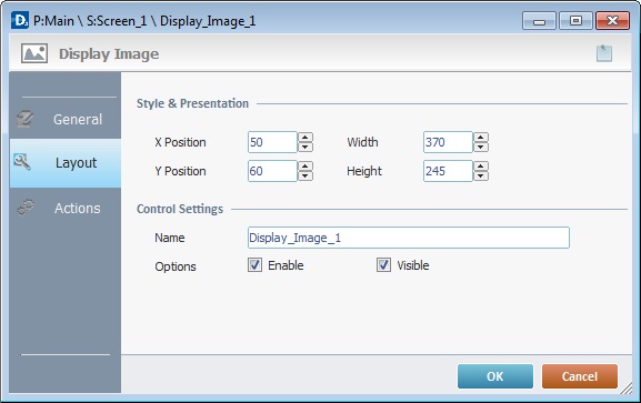
8. Maintain the given values or specify the object's position/size, within the screen, by providing the "X" and "Y" coordinates as well as "Width" and "Height".
Detail of Position/Size values

9. In the "Control Settings" section, attribute a name to the image. This name is displayed in the tree view.
10. Consider whether to check the following options or not:
"Enable"
Activates the object's features.
"Visible"
Controls the visibility of the object on the device's screen.
11. If the project requires an action to be executed after the object is displayed, such as a "go to the next screen", continue to step 11.
If not, end the addition of a "Display Image" object by clicking to apply all of the chosen options in both tabs ("General"and "Layout").
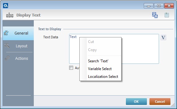
Use the right click in MCL-Designer's input boxes to access certain features regarding the input box's option as well as general actions such as "Copy"; "Paste"; "Search".
Ex: If you right-click the "Text Data" input box (included in a "Display Text" properties window), you are provided with the "Paste", "Search..." and "Variable Select" options.
If you right-click any other input box, it will provide other possibilities.
12. Go to the "Actions" tab.
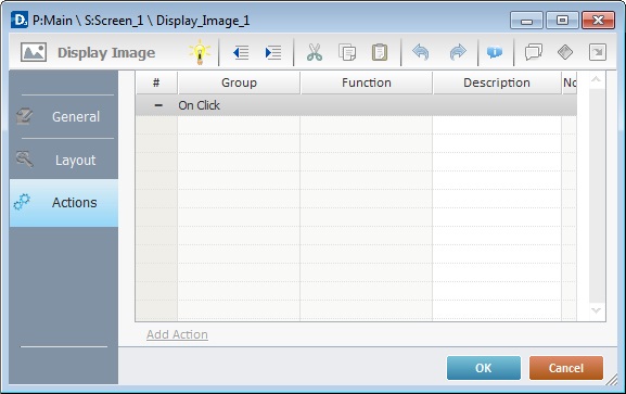
There is always a default event contained in an object (ex: "On Click"; "On Timer"; "On Change"; etc.). In this case, the default event is "On Click". An action (usually a "Go to" process) must be added to be executed upon the "On Click" event. If there is no action/process attached to the default event, it will not proceed.
13. To edit the event, double-click the event row ("On Click") OR right-click the event row and select "Edit..." in the resulting menu. Either of these choices opens an "Edit Event" window.
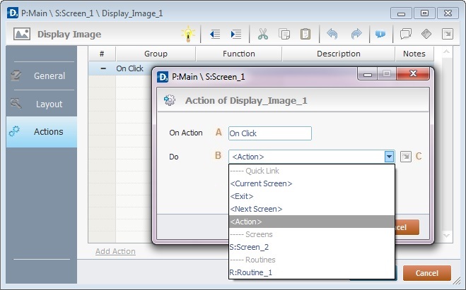
14. Edit the event's action in the "Edit Event" window by selecting from the available options.
A |
This event, performed by the device operator, is the "trigger" that enables an action to advance the application. It cannot be modified. Default event: "On Click" - Is triggered when the operator clicks the "Display Image " object. |
B |
Provides targets for a "Go To" action (see Working with the Branch Processes Group). After the device operator has fulfilled the "On Click" event, the workflow will proceed to the selected destination. If you want to add processes other than a "Go to", select the <Action> option. |
C |
Provides quick links of a "Go To" action ("Next Screen"; "Exit"; etc.) to be executed when the event is fulfilled. See Detail of a |
Detail of a  window
|
This window is an alternative to the drop-down list of destinations. Select a destination screen or routine within the same program as this object, in the left table. Specify the target even more by selecting from the table to the right. The available options are a consequence of your choice in the left table. If you want to add more processes, select the <Action> option. Finish this operation by clicking |
15. If required, add processes to the default event. See Adding and Editing Processes.
This object has predefined local variables (only available in event context). See Display Image's Predefined Variables.
Before concluding the addition operation, check the following:
Remember that the "Enable" option (located in the "Layout" tab) must be checked so that the added actions/processes run.
If required, click  (which is located on the upper right corner of the "properties" window) to attach any relevant notes to this object. Enter your text in the resulting window. This information is displayed in the "Developer report". See Report.
16. Click in the "Actions" tab to apply the choices made.
The "Display Image" object has been successfully added to the screen.
If any subsequent edition of the object's properties is required, double-click the "Display Image" OR select " 'Display Image' Properties" (in its right-click menu) to open the properties window.
Use the Drag-and-Drop mechanism to add image resources to the screen. Open the "Resources" module, drag the required image resource from the "Images" section and drop it on the screen.
Any added image is always positioned behind any other object in the screen (unless it is also a "Display Image" object).
"Display Image" Predefined Local Variables
This object has predefined local variables (only available in event context).
Event |
On Click |
Variable Name |
L_Control_Name |
Variable ID |
&0a |
Description |
Stores the object's name (*) |
* Defined in the object's "properties" window ("Layout" tab).
