|
Widget: Time Chart |
  
|
Widget: Time Chart
|
Widget: Time Chart |
|
Overview
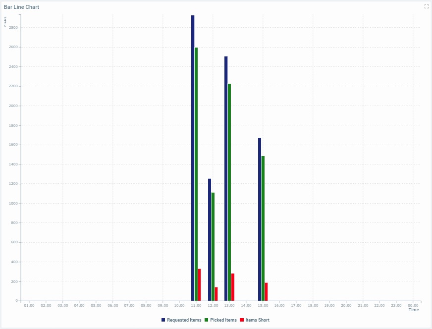
The Time Chart widget provides data that is organized as a time chart and displayed with the use of up to 4 different chart styles (bars, lines, area, or points) that can be used individually or in the same chart.
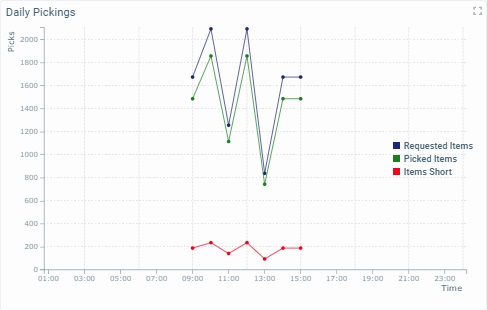
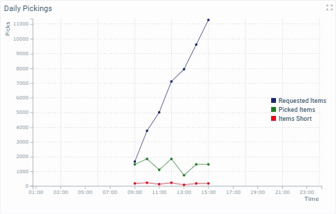
The Time Chart widget allows you to view the intended data and how those values have progressed in time. The values of a Time Chart can be represented as bars, lines, areas and/or points. You can create a Time Chart with only one type of value representation or use more or all value representations in the same Time Chart (each series has its own value representation).
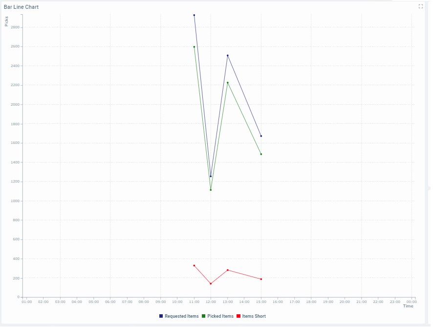
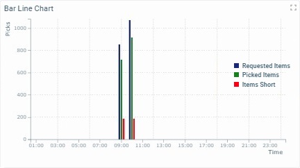
Bar Value Representation |
Line Value Representation |
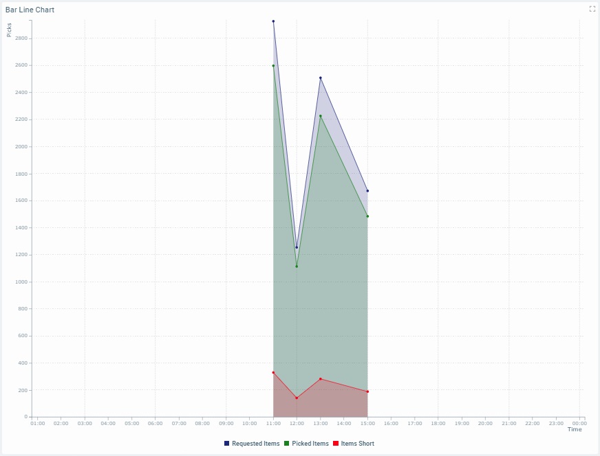
Area Value Representation |
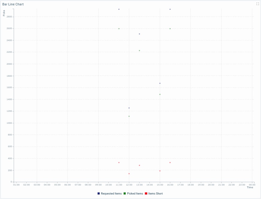
Point Value Representation |
|
|
|
|
The Dashboard's Details Page
•To access a widget's settings you must open the details page of the dashboard that includes the widget.
•Since you must check the intended dashboard in the "Dashboard Management" page and click  to open it, the details page is, automatically, set to edit mode.
•To add a Time Chart widget to a dashboard, open the intended dashboard, click  and select the "Time Chart" widget from the listed widgets in the pop-up window. See To Add a Widget to a Dashboard.
•The editing of a widget's settings is, automatically, viewed in the dashboard's Preview Section (to the right).
The following step-by-step focuses on a dashboard details page with an added Time Chart widget whose settings you can view and edit.
To View/Edit the Time Chart Widget's Settings
If the selected dashboard has been created at account level, you will NOT be able to edit any of its settings - the details page will open in view mode without the possibility to set it to edit mode.
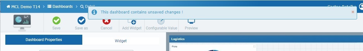
If you access a widget, edit its settings but do NOT save those changes before exiting, the next time you open that dashboard, the page will display a message warning you that there are unsaved changes.
Click "Save" to ensure that the previous changes are not lost or "Cancel" to discard those previously unsaved changes and start fresh.
Step-by-step
1. Open the details page of the dashboard that contains a Time Chart widget.
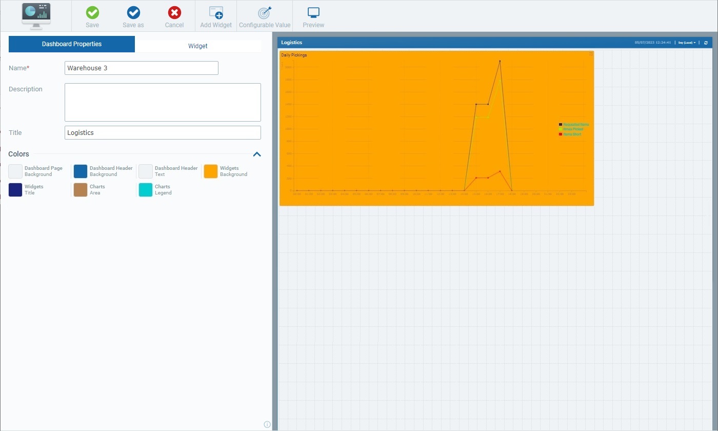
A dashboard details page includes 2 main tabs:
•The "Dashboard Properties" tab that relates to the settings of the dashboard itself. See Dashboard Details.
•The "Widget" tab which, once you select a widget in the Preview Section, displays the settings of that selected widget.
When you open a dashboard's details page, the "Dashboard Properties" tab is open by default.
2. Select the Time Chart widget.
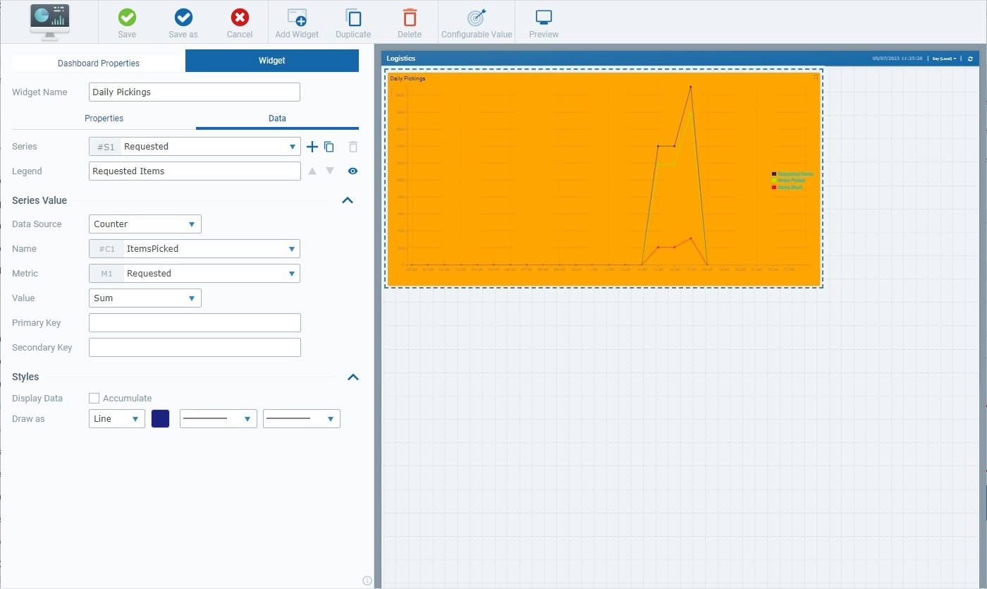
Selecting the Time Chart widget, automatically, opens the "Widget" tab with the corresponding settings.
The "Widget" tab includes a common section (related to the Time Chart's name) and 2 child tabs - "Properties" and "Data".
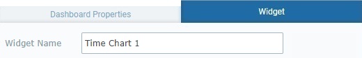
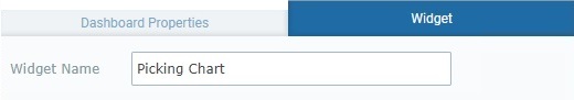
The first available option in the "Widget" tab is "Widget Name". This name identifies the widget in the MCL-Mobility Platform but it is NOT displayed by the widget itself.
The system always suggests a name for an added widget - it is a combination of the widget type and a number (ex: "Time Chart 1" for the first Time Chart widget you add to the dashboard, "Time Chart 2" for the second one and so on).
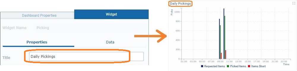
3. If required, enter/edit the name of the Time Chart widget.
 We recommend you rename the widget when you add it, in the "Widget Name" field, in a way that relates to the data it is meant to display.
4. Open each child tab ("Properties" and "Data") and view/fill in the available options as necessary.
The "Properties" tab is used to define the style of the widget.
It includes several sections that are organized as accordions - click the corresponding arrow (to the right) to expand/collapse the content, as needed.
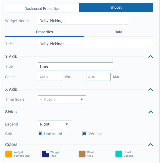
This tab provides the following information:
Title |
This option relates to the title that is displayed in the widget's upper left corner. This does NOT identify the widget (that is defined in the "Widget Name" field). There is a default suggestion ("My title") but we recommend a widget title related to the displayed data/values.
Define/edit the widget's title. |
||||||
Y Axis |
|||||||
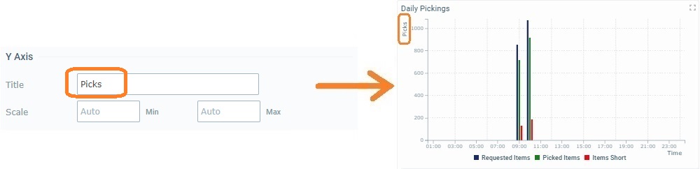
Title |
Refers to the title for the values displayed vertically ("Y Axis").
Enter a title - it will be displayed vertically.
|
||||||
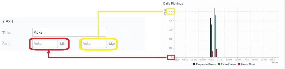
Scale |
The scale's minimum and maximum values in the "Y Axis".
Define minimum and maximum values for the Time Chart's "Y Axis". When no value is defined, "<Auto>" is set and the widget, automatically, defines the "Max" scale value as being the highest received value and "Min" as the lowest received value.
|
||||||
X Axis |
|||||||
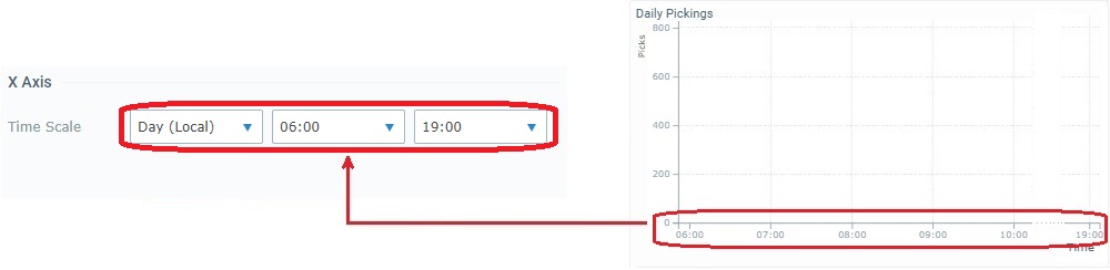
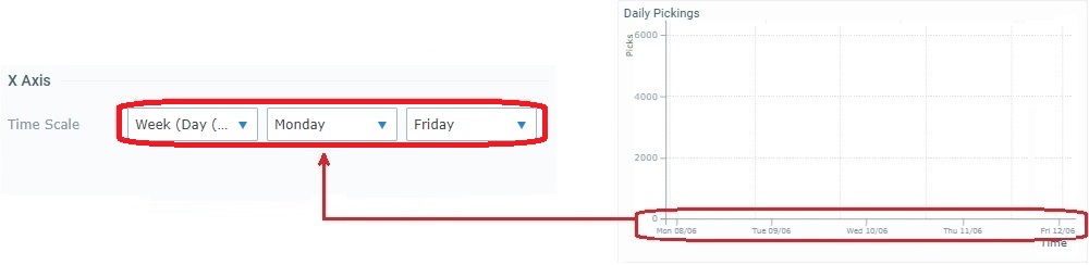
Time Scale |
The time scale for the data that is displayed in the selected widget which can be aggregated/grouped by "Hour", "Day (UTC)", "Day (Local)", "Week (Day (UTC))", "Week (Day (Local))" or "Month". Selecting the "Auto" option ensures that the widget's content is aggregated/grouped according to the resolution applied to the dashboard (which is set using the related resolution drop-drown in the upper right corner).
In addition to these default time frames, the drop-down may also include time periods from a Time Period profile (= a profile you can create with specific time periods representing specific working hours/shifts so the data sent by your devices can be aggregated according to those working hours/shifts). See Profiles.
If you have a Time Period profile in mind and its time periods are NOT listed here, go to the "Site Details" sub-module, open the "Time Period" tab and check which profile is defined for the site and edit it, if necessary.
Selecting certain time periods activates fields that define the beginning and end of that time period.
Ex: Selecting "Day (Local)" activates 2 boxes representing the day's start/end hours.
Ex: If "Week (Day (Local))" is selected, you will also have fields to define the day the week begins and ends with.
Define the intended time period from the drop-down (and start/end hours, when necessary) OR select "Auto".
The defining of a specific time scale for the widget means the displayed values will NOT be affected by the dashboard's resolution. For instance, if your widget has a "Day (Local)" time scale and you set the dashboard's resolution, in the related drop-drown (in the upper right corner) to "Month", that widget will NOT change its values and time scale, it will continue to show values aggregated/grouped by "Day (Local)". ONLY the widgets with an "Auto" defined period will group their values/adopt the newly defined resolution. |
||||||
Styles |
|||||||
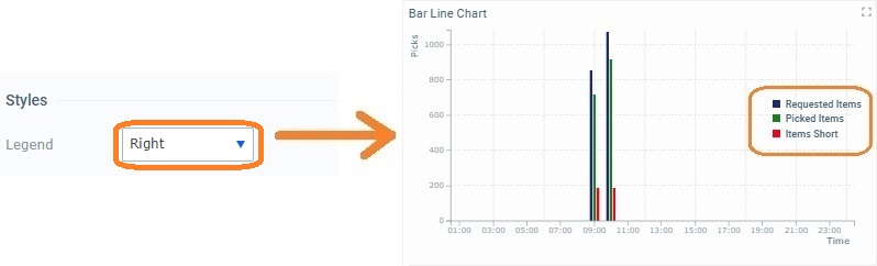
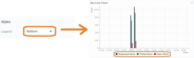
Legend |
This option relates to the position of the widget's caption/legend - it can be placed at the bottom ("Bottom") or to the right ("Right") of the Time Chart or have no legend ("None").
Select a position for the widget's caption from the drop-down. |
||||||
Grid |
The Time Chart's guiding lines - this widget can have "Horizontal" or"Vertical" lines or both, forming a grid, to help read the Time Chart.
Check/uncheck the "Horizontal" and "Vertical" options to enable/disable the corresponding guiding lines. |
||||||
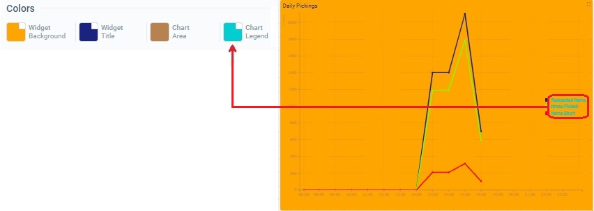
Colors |
|||||||
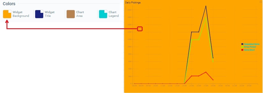
Widget Background |
The color defined for the widget's background.
Maintain or choose a different color by clicking the corresponding box to open a "Colors" pop-up window and defining a new color. See Details on the Widget's "Colors" pop-up window |
||||||
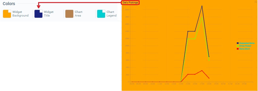
Widget Title |
The color defined for the widget's title, meaning, the text you defined in the "Title" field and is displayed in the upper left corner.
To change the color, click the corresponding box to open a "Colors" pop-up window and define a new one. See Details on the Widget's "Colors" pop-up window |
||||||
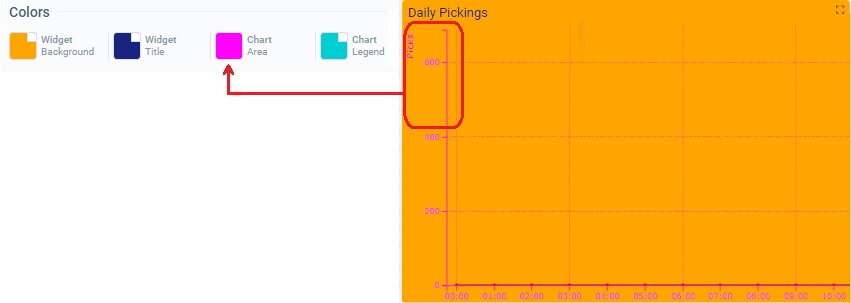
Chart Area |
The color defined for the widget's chart area (= the title of the Y axis plus the chart grid lines in the "Y" and "X" axes).
Maintain or choose a different color - click the corresponding box to open a "Colors" pop-up window and define the new color. See Details on the Widget's "Colors" pop-up window. |
||||||
Chart Legend |
The color defined for the widget's captions.
Maintain the color or select another one by clicking the corresponding box to open a "Colors" pop-up window and defining a new color. See Details on the Widget's "Colors" pop-up window |
||||||
The "Data" tab handles the widget's multiple series (a series = a set of data represented in a widget's chart/table). This tab allows you to create the necessary series, select the value each one should display and its source as well as define its style (ex: customize a series' color).
Certain sections are displayed as accordions - click the corresponding arrow to the right to expand/collapse the content, as needed.
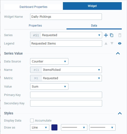
This tab provides the following information:
Series |
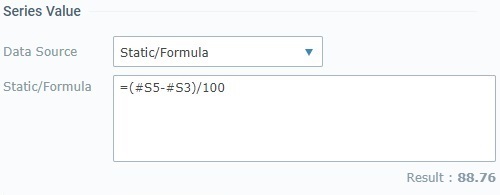
The data to display in this widget is grouped into series - each bar, line, area or point represents a series. The corresponding internal reference for each series is "#S <number>" (ex: "#S4") - it is attributed by the system and CANNOT be edited. It can be used, for instance, in formulas, when you want to identify a series. Ex: A formula defined in a series with a "Static/Formula" data source - "=#S7-100". A Time Chart can accommodate up to 20 series.
Use the attached
•Click ▪The default name suggestion for each series is "My Series <number>" (ex: "My Series 1") but we recommend renaming the new series according to the value it will represent. ▪Fill in the related options to define its properties (data source, color, etc.). ▪If you add another series, the newly added one comes to focus in this box.
•Click ▪The duplicate's name will be the name of the original plus "_copy" - the duplicate becomes the selected series in this box. ▪Rename the duplicate so it illustrates the value it will represent and fill in/review the related options to define its properties (data source, color, etc.).
Do NOT forget that you can only add/duplicate up to 20 series.
•Click ▪This option is ONLY enabled once you have more than one series (it is NOT possible to delete all the series of a widget).
If required, use the
•Click
•Click
Maintain or select a different source for the current series' data. Changing the data source affects the related available options below - there is an immediate refresh to show the options that relate to the newly defined data source.
|
||||||||||||
Legend |
The caption for the series - it represents the name of the series to be displayed in the widget.
Enter/edit the selected series' caption, as required. Keeping this field empty means the widget will display the series' name (defined in the "Series" option). |
||||||||||||
Series Value |
|||||||||||||
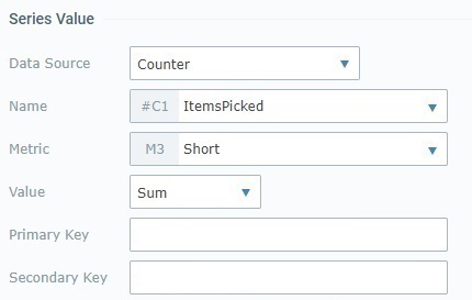
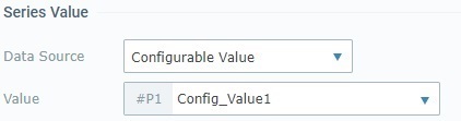
Data Source |
This field refers to the source of the data to be represented by the currently selected series (in the "Series" option). The Time Chart widget allows for 3 data source types:
"Counter" A counter is an entity in our MCL-Mobility Platform account that aggregates specific data (statistic results of processed metric values that have been sent by MCL applications/paired devices). See Counters. Having this data source means the series presents a specific value, from a specific counter. This data source type enables these options:
"Static/Formula" The necessary value to feed the series is provided by you - the series displays the static value OR the result of the formula you have entered. Selecting this data source type activates the following option:
"Configurable Value" A value that is configured for a specific purpose, as a sort of KPI (Key Performance Indicator). For instance, it can be used to measure the level of performance success/failure based on a given threshold/operational goal. The following option becomes available when you select this source type:
The "Value" drop-down is ONLY available if there are already configured values for the current dashboard. If you have a
|
||||||||||||
Styles |
|||||||||||||
Display Data |
If "Accumulate" is checked, it means the time chart will display the current value combined with previously received values. If unchecked, the widget's display will ONLY include the current value.
Examples:
Check/uncheck the "Accumulate" option as required. |
||||||||||||
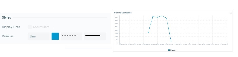
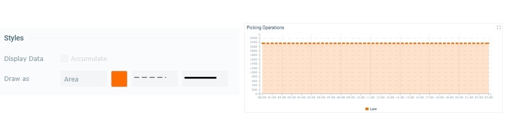
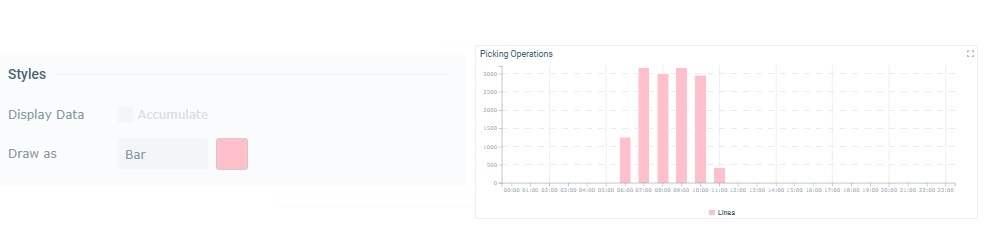
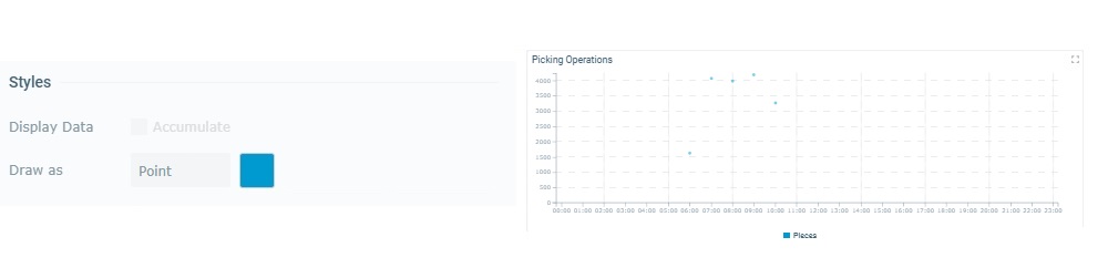
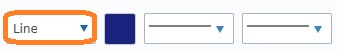
Draw as |
Refers to the value representation that is defined for the selected series - "Line", "Area", "Bar" or "Point". Each representation has its own options:
|
||||||||||||
5. Once you are done editing, click  to ensure that your changes are applied.
If you exit this page (the dashboard's details page) without saving your edition, the "Auto-Save" mechanism keeps these changes for some time. You can save them the next time you access the dashboard - there is a message to remind you that there are unsaved changes. See The Dashboard's "Save" Feature.
 to add more series.
 ;
;